Reusable Blocks
Updated 5 months ago
The Reusable Block is a block of content that appears on different pages. It allows editing such content in one place and seeing changes applied to all places it shows.
You can create new Reusable Blocks and edit existing ones at Templates > Reusable Blocks.
You can also create footers with Reusable Blocks.
Reusable Blocks for Content #
You can add a Reusable Block to the content or Page Template by adding the same name element.
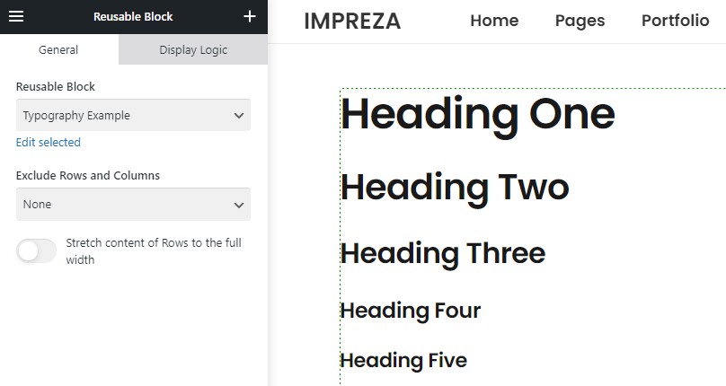
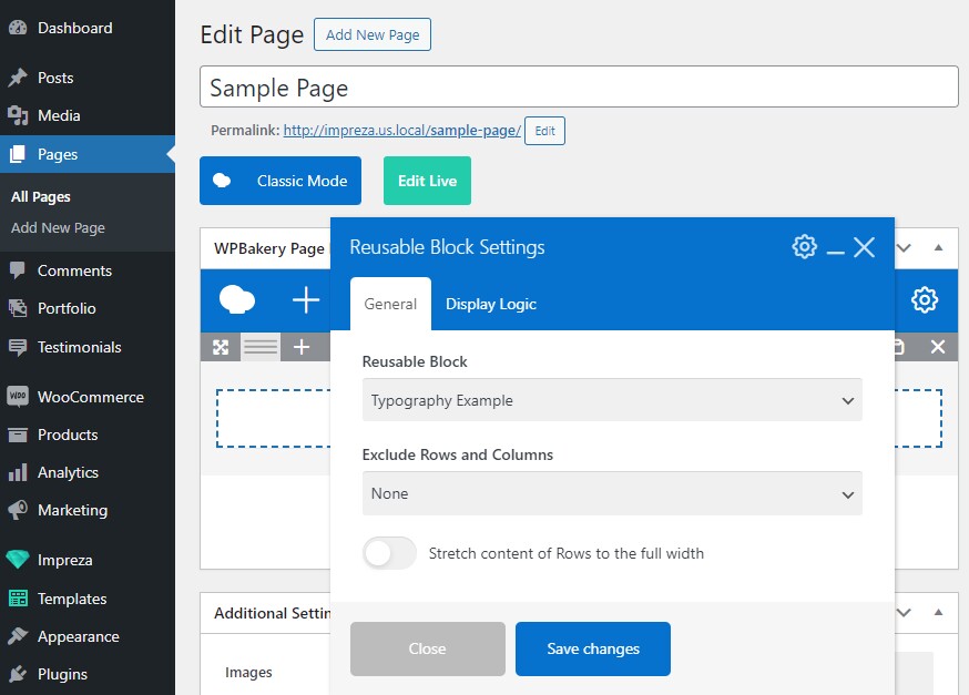
When you add a Reusable Block to the content, it might also have its rows and columns. You can use the Exclude Rows and Columns setting to fit this Reusable Block to the content layout:
- None - a default parameter parameter. It will leave the columns inside and around the Reusable Block as is, without any changes.
- Inside selected Reusable Block - it removes rows and columns inside the element. It leaves rows and columns around the Reusable Block as is.
- Around this element - it removes rows and columns around the element. It leaves rows and columns inside the Reusable Block as is.
The Reusable Block has the Row/Section element that adds extra spacing around the ActionBox.
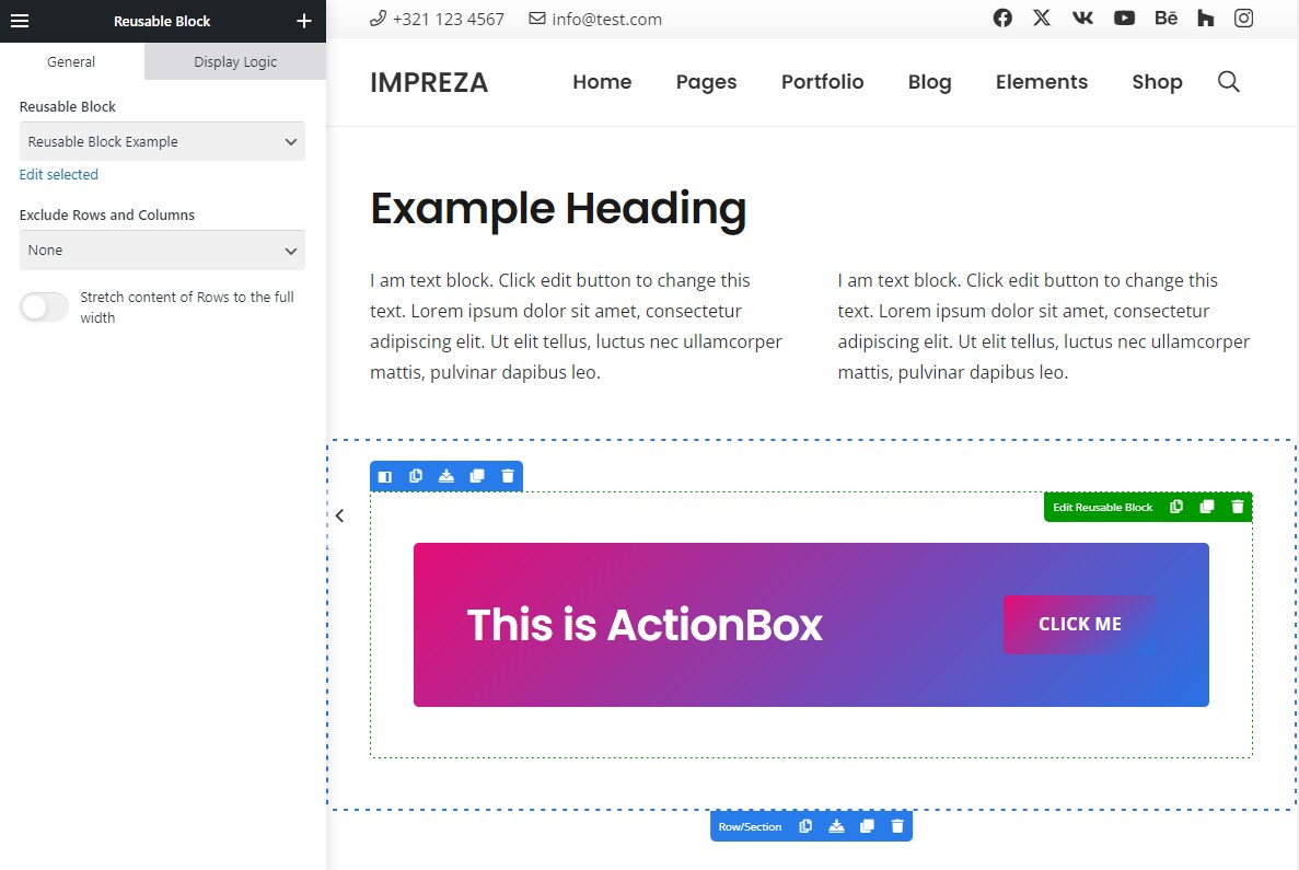
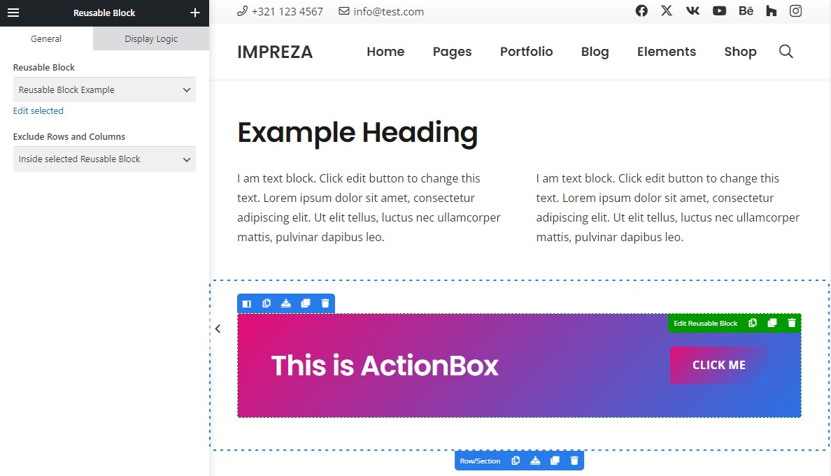
You can set the Exclude Rows and Columns setting to Inside selected Reusable Block to remove this extra spacing.
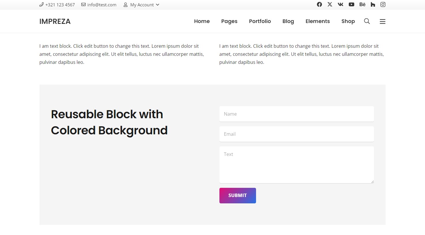
The Reusable Block has the Row/Section element with a gray background. It's added in the parent Row/Section element, adding extra spacing and a white background.
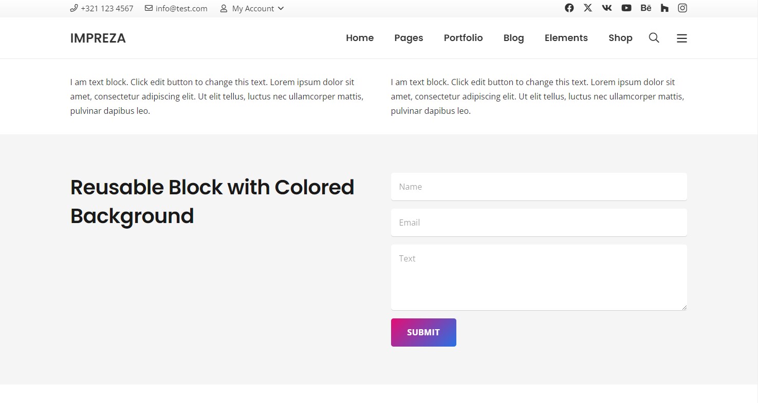
You can set the Exclude Rows and Columns setting to Around this element. It removes the parent Row/Section, stretching the Reusable Block to fit the layout better.
When the Exclude Rows and Columns is set to "Inside selected Reusable Block," it removes the Row/Section element inside the Reusable Block. It will also remove all Design settings specified inside this Row/Section.
Reusable Blocks for Menus #
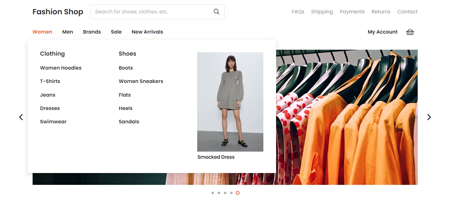
You can use Reusable Blocks inside the menu. It allows the creation of custom menus with any layout and elements inside.
While editing the menu at Appearance > Menus, you can add a Reusable Block as menu item. If Reusable Blocks are not in the list of available menu items, first activate it in the Screen Options at the top.
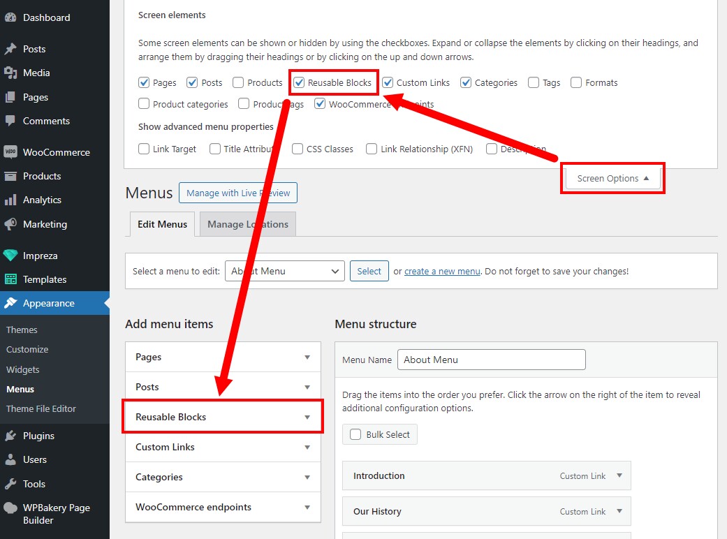
By default, when you add a Reusable Block to the menu, it has the active checkbox "Exclude Rows and Columns." Deactivate it if you need multiple rows and columns inside the Reusable Block.
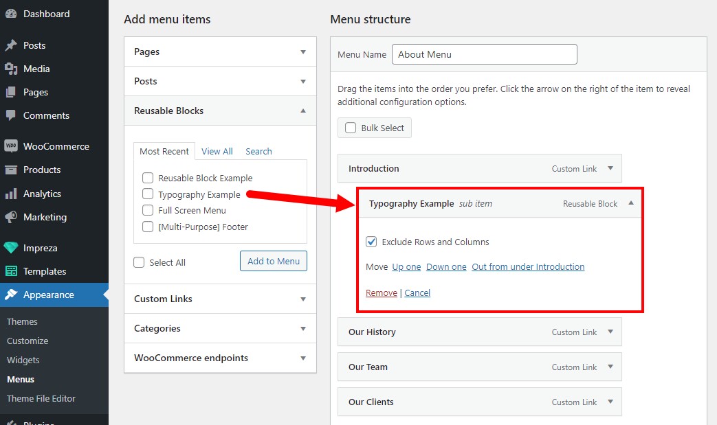
Reusable Blocks for Popups #
You can use Reusable Blocks as content for the Popup element.
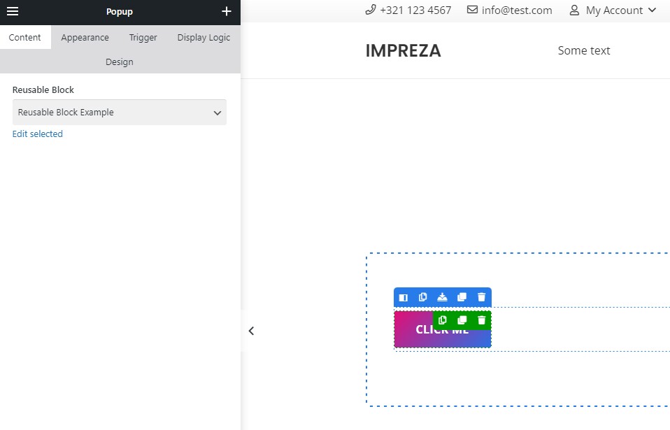
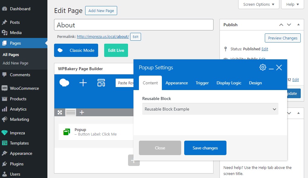
You can use it to create a complex layout inside the Popup or show a custom menu in a Popup.
You can also add a Popup element to the Grid Layout and specify the Reusable Block as its content source. In this case, the Post Title and similar elements in the Reusable Block will fetch and display the titles of relevant list items.

Reusable Block as "No results" message of List/Carousel #
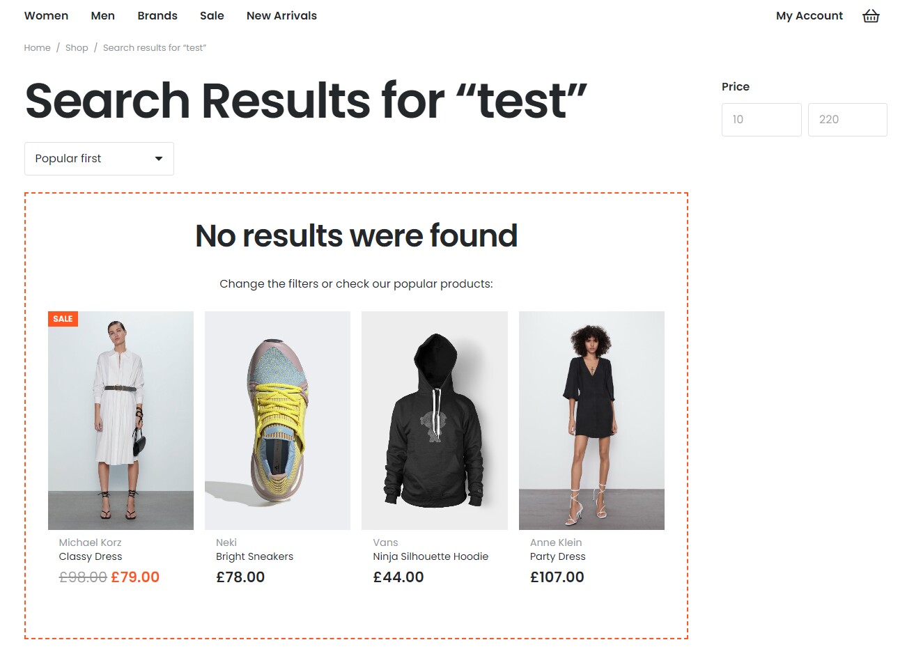
In the Grid and List elements you can set up the "Action when no results found" to be the "Show the Reusable Block."
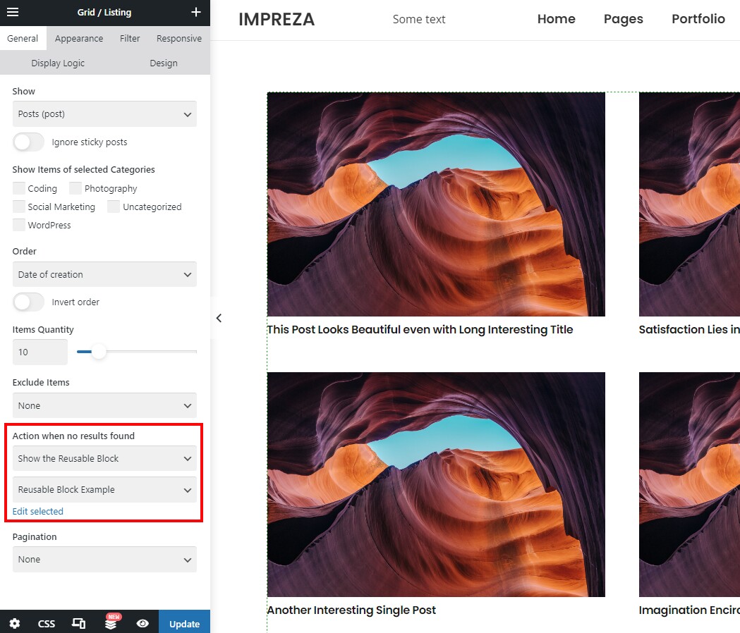
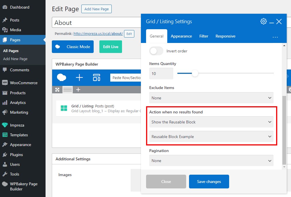
It allows showing custom content when the Grid element has no elements to view. For example, when there are no products matching the search query.
Reusable Blocks for Titlebars and Sidebars #
You can use Reusable Blocks as Titlebars and Sidebars on your site. Go to Theme Options > Advanced and activate the "Titlebars & Sidebars" and "Use Reusable Blocks for Sidebars" settings.
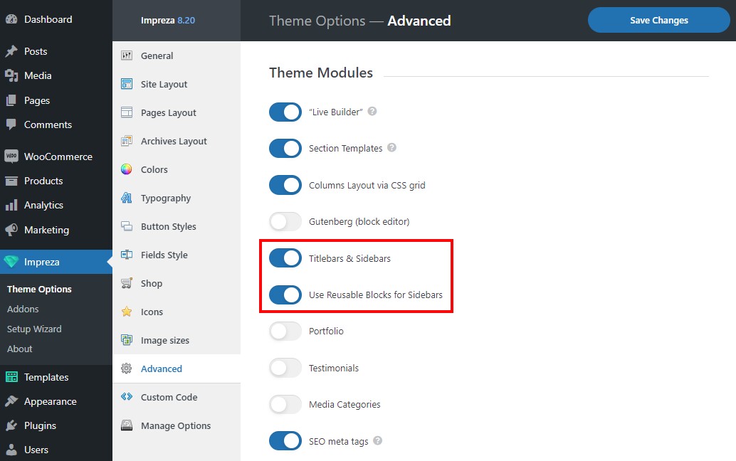
After this, use the Page Layout settings to assign Reusable Blocks as Titlebars and Sidebars. For more information on Page Layout, read the relevant section.
Reusable Block as shortcode #
Check how to use elements as shortcodes.
At the moment, the [us_page_block id="1234"] shortodes do not work correctly, if you paste them into any fields, except the main content area of any page/post/custom post type. This happens for optimization reasons. Subcribe to this feature request to receive any news.

