Headers
Updated 2 months ago
The header is a site area at the top of every page. You can customize and create multiple headers to use them on different pages.
Creating Headers #
Header Builder #
The header builder is a drag-and-drop constructor that allows you to customize the content and layout of the header.
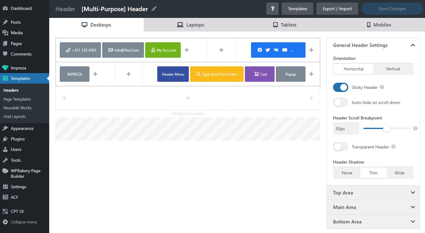
Header Areas #
The header consists of three rows called "areas":
- Top Area.
- Main Area.
- Bottom Area.
Each area has "Left," "Center," and "Right" cells for the elements.
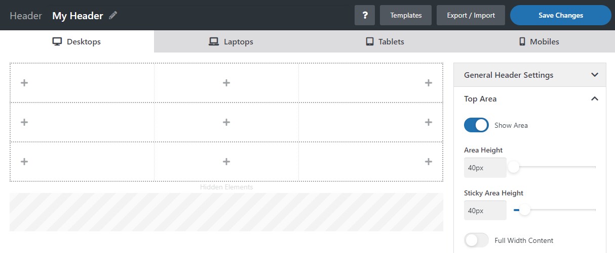
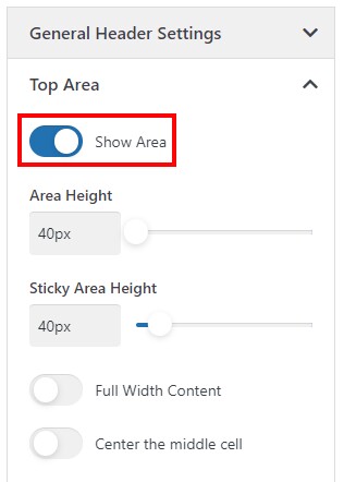
Every area has its settings for height and colors. The "Top Area" and "Bottom Area" are optional. You can hide them by deactivating the "Show Area" switch in the side panel with settings.
The "Hidden Elements" area allows hiding elements for a particular header state. Drag and drop the element to the "Hidden Elements" area to hide it for a specific device (desktop/laptop/tablet/mobile).
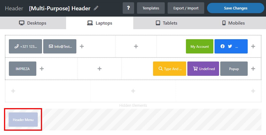
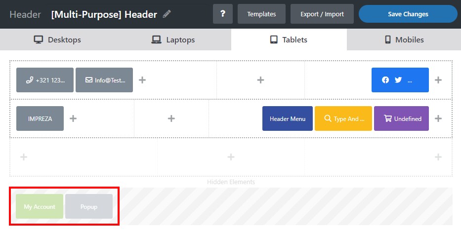
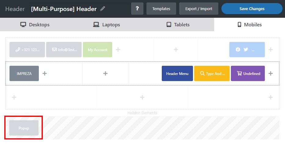
Header States #
The header state refers to a device-specific header layout and a composition of its elements.
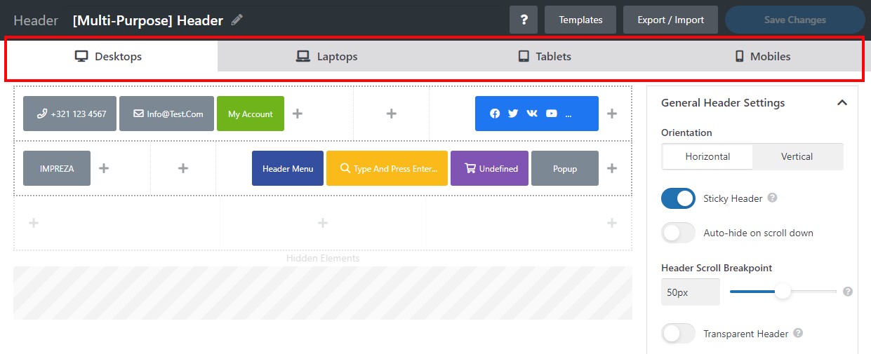
The header has four states:
- Desktops.
- Laptops.
- Tablets.
- Mobiles.
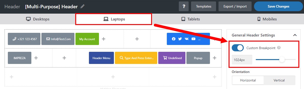
By default, the screen width breakpoints defining which header state to apply are bound to the screen width settings at Theme Options > Site Layout.
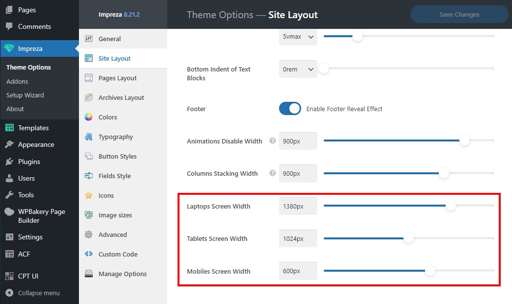
You can override these global breakpoints for the header by using the Custom Breakpoint setting for each state.
You can customize the element layout, hide/show areas and separate elements, pick the header orientation, and apply sticky and transparent behavior for each header state.
The position of header elements and Header Settings are independent in different header states. When you change them on any header state, this doesn't affect other states.
The content and element settings NEVER DIFFER on different header states. When you change element settings on any header state, these changes apply to all states.
Header Settings #
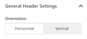
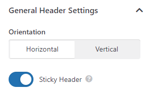
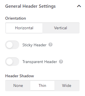
General Header Settings: Orientation #
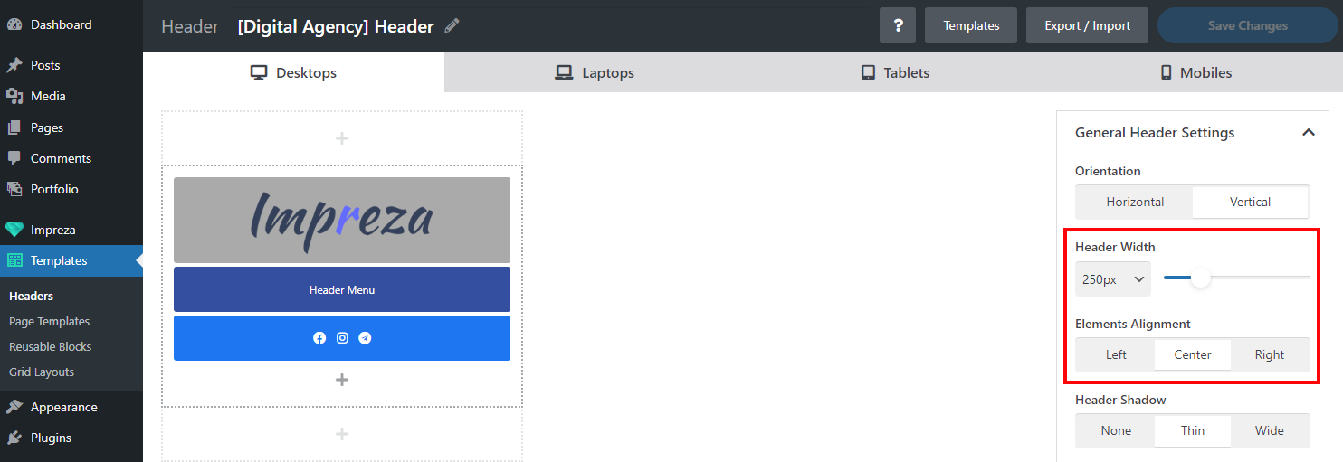
This option allows switching between the header's Horizontal and Vertical layout. By switching between the header states for desktops, laptops, tablets, and mobiles, you can assign different orientations for different devices.
With a vertical header, all its elements are shown in one column on the side, and you can adjust its width and element alignment.
General Header Settings: Sticky Header #
If this setting is active, the header will stay at the top of the screen when you scroll the page.
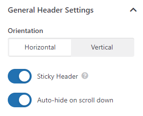
General Header Settings: Auto-hide on Scroll Down #
If this setting is active, the header will hide when the page is scrolled down and appear on scroll up. This option is only available for sticky headers.
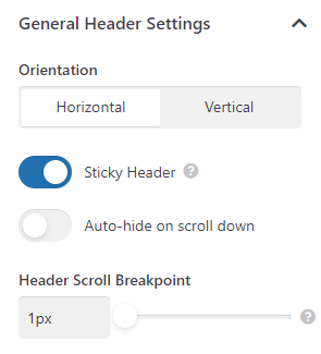
General Header Settings: Header Scroll Breakpoint #
This option specifies the scroll distance from the top of the page, after which the header will stick to the top. This option is only available for sticky headers.
General Header Settings: Transparent Header #
If this setting is active, the header will use transparent header colors in its initial position.
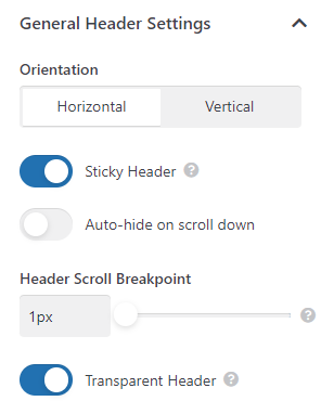
This option is available for regular and sticky headers and is commonly used when the header's initial position has some background (color, image, or video).


General Header Settings: Header Shadow #
This option adds one of the pre-defined shadow effects to the header.
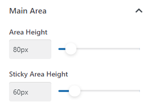
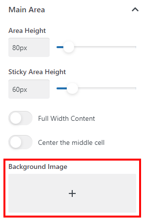
Main Area: Area Height #
This setting specifies the header area's height. If the header is sticky, you can specify a different height for its sticky state.
Main Area: Full Width Content #
If this option is active, the area content's width will adjust to the full available width of the screen.

If inactive, it adjusts to the Site Content Width specified in Theme Options > Site Layout.
Main Area: Center the Middle Cell #
If this option is active, the content inside the middle cell will be centered horizontally.
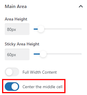
When inactive, the content of all three cells spreads evenly across the available width.
Main Area: Background Image #
This option allows adding a background image to the area.
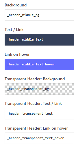
Main Area: Colors #
A set of options that allows to set colors for the content of the header's regular and transparent states via the relevant color pickers.
Top / Bottom Area #
The Show Area switch allows you to show/hide the top and bottom areas of the header. When shown, the rest of the settings are similar to those of the main area.

Header Elements #
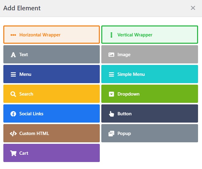
Click on a "Plus" icon to add header elements:
- Horizontal Wrapper
- Vertical Wrapper
- Text
- Image
- Menu
- Simple Menu
- Search
- Dropdown
- Social Links
- Button
- Custom HTML
- Popup
- Cart
Header Templates #
You can use one of the pre-designed header templates by pressing the Templates button.
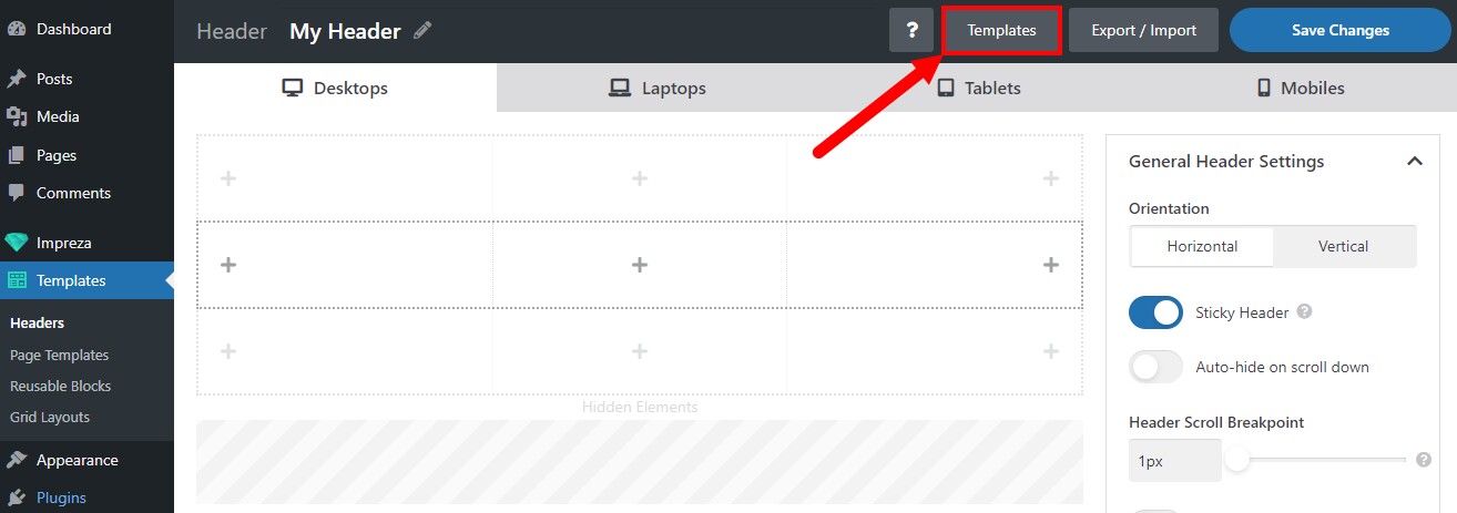
Click the preview to import a header template:
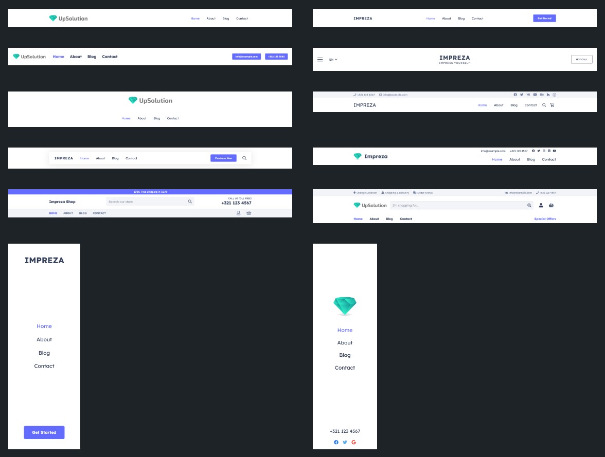
When you use the header template, it removes all the elements and settings added earlier.
Header Export/Import #
You can export/import any header with all its elements and settings. This option can be useful to transfer headers between the sites.
Press the Export/Import button, copy/paste the code into the text area, and click the Import Header button.
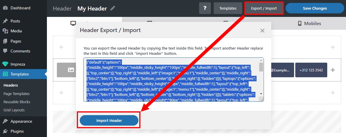
The import process removes all the elements and settings added to the header earlier.
Assigning Headers #
You can assign headers:
- Globally, for post types and archives. Use relevant settings at Theme Options > Pages Layout, Theme Options > Archives, and Theme Options > Shop.
- To the posts of specific taxonomy. Open taxonomy settings and specify the header for archives (Archives Layout) and posts (Pages Layout).
- To individual posts/pages. Use the Page Layout settings to specify the relevant header.
Creating a separate header is unnecessary if you only need to change the header's Sticky or Transparent behavior for individual page(s). In the Page Layout settings, you can pick the main header and override its Sticky and Transparent properties for the current page.
Header Initial Position #
When you edit a page with a sticky header, you can select the "Sticky Header Initial Position" in the Page Layout settings.
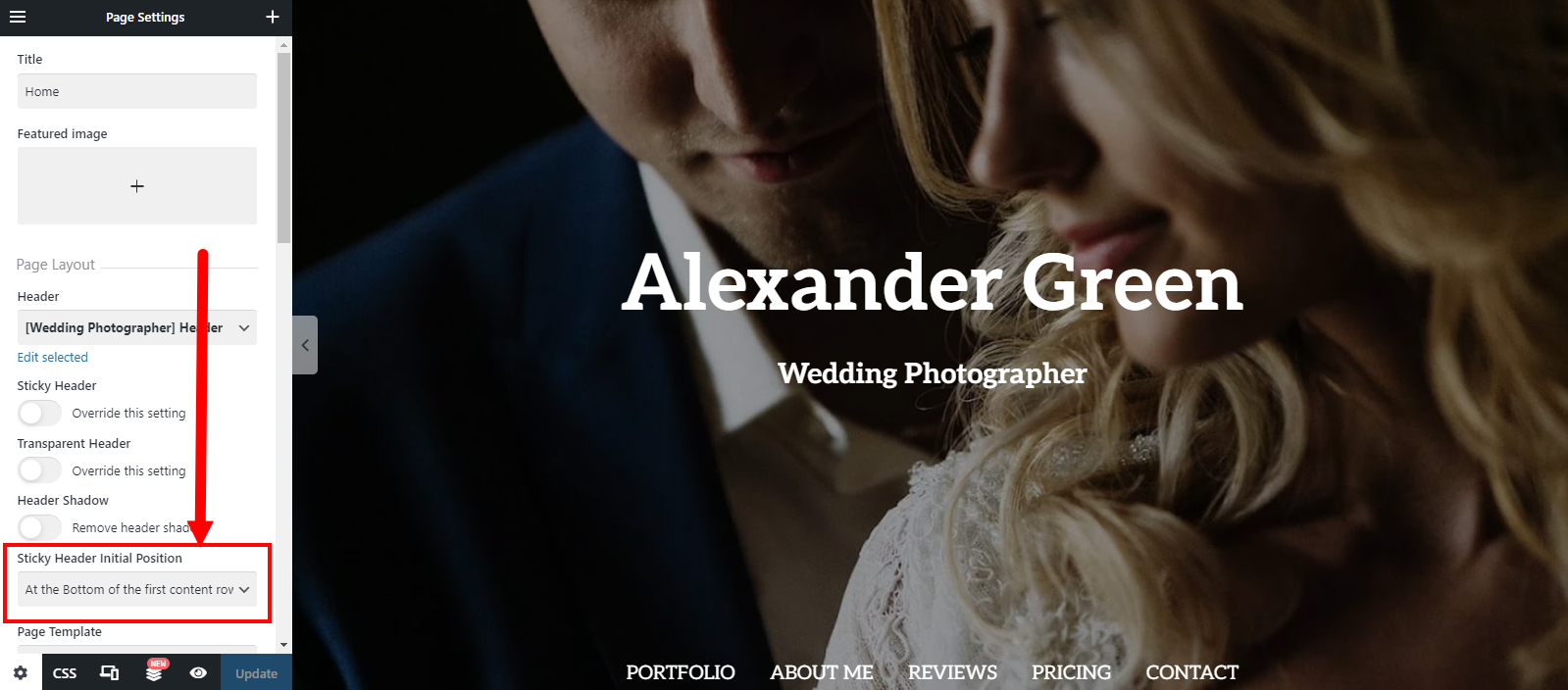
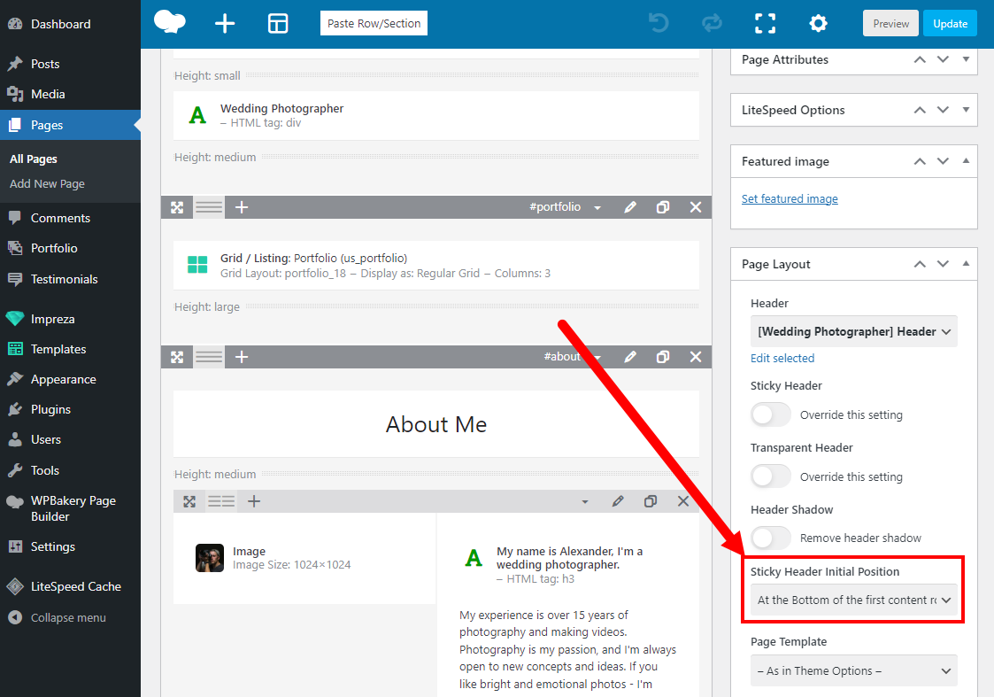
The sticky header will start scrolling with the page scroll after it passes the initial position specified.
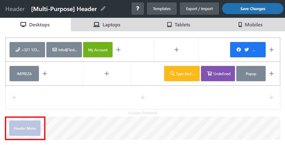
Remove Content Offset to Header Height #
By default, an offset equal to the Header's height is added before the first content Row.
(padding-top added to the l-section-h container). In 99% of cases, this is the correct behavior, as the offset prevents the website header from overlapping the content.
However, in some cases, such content overlapping may be necessary by styling, check the screenshots below:


When you edit the page, in its Page Layout settings, you can remove this offset by activating the "Remove content offset to header height" switch and selecting the device types where it is not needed.

FAQ #
How to add "My Account" link to the Header #
My Account is a default page added by the WooCommerce plugin. You can add it to the Header via the Button or Text element (or any other element with the link) and specify the Link leading to this default page URL.