Popups
Updated 5 months ago
The Popup element is used to show a popup with a custom content, including Reusable Blocks. It is available in:
- Live Builder
- WPBakery Builder
- Header Builder
- Grid Layout Builder
How to open a popup by clicking a custom element #
- Add the FlipBox element, go to its Design settings and set the Element ID, for example
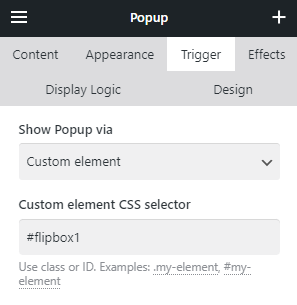
flipbox1. - Add the Popup element, in its Trigger settings, select Show Popup via Custom element, and set
#flipbox1.
How to open a popup by clicking a button (or text link) inside another element #
- Add any element with a button/link inside. Specify a Link option, for example
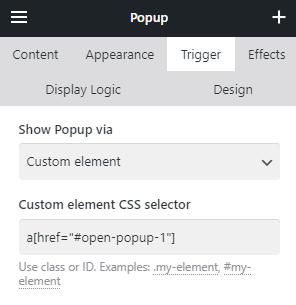
#open-popup-1 - Add a Popup element. In its Trigger settings, select Show Popup via Custom Element, and add the following value:
a[href="#open-popup-1"]
How to show a popup for site visitors only once #
- Add a Popup element.
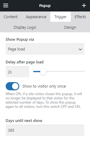
- In its Trigger settings, select the Show Popup via Page load.
- Activate the "Show to visitor only once" switch.
- Specify the Days until next show. Until then, it won't trigger again for the same visitor. You can use fractional values, for example
0.25is interpreted as 6 hours.
How to show a popup for a specific date #
- Add a Popup element.
- In its Trigger settings, select the Show Popup via Page Load.
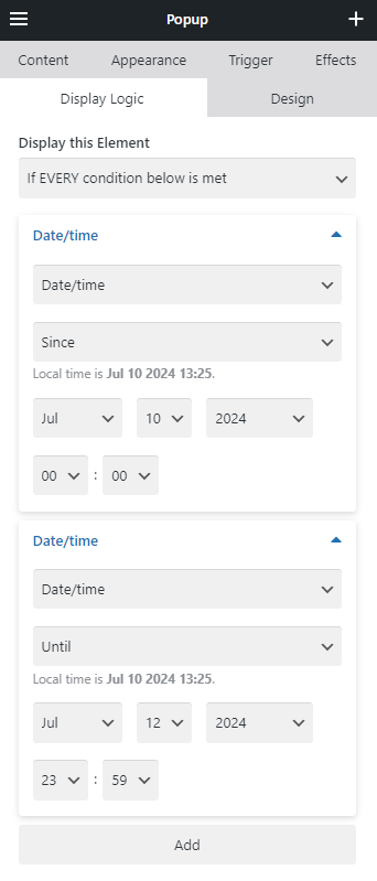
- In its Display Logic, choose if EVERY condition below is met.
- Add Date/Time condition Since and specify the start date & time.
- Add Date/Time condition Until and specify the end date & time.
For example, a popup for the sale that takes place on July 10 - July 12 will have "Since July 10, 00:00" and "Until July 12, 23:59":
How to close a popup by clicking a custom element #
Popup will close upon clicking any element (inside the popup) with the Link specified as#
It could be a text link within its text, or a custom element within a Reusable Block with the relevant Link added in its settings.

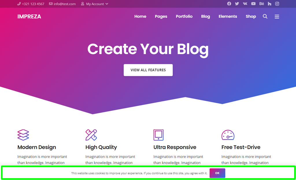
Cookie Notice #
Allows showing the notification about cookies usage to the site visitors.
This built-in cookie notice only shows a "consent" option for your website visitors. If you need more control over cookies/visitor agreements, use the appropriate plugins.
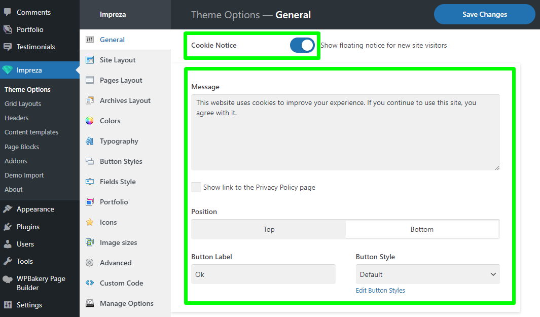
When turned on, you can specify the:
- Message — the content of the notification
- Show link to the Privacy Policy page — allows showing the link to the Privacy Policy page, which you can set up in the Privacy Settings admin page
- Position — defines if the Cookie Notice should appear at the top or the bottom of the screen.
- Button Label — defines the text of the submit button.
- Button Style — a dropdown defining the style of the submit button.
