Accordions and Tabs
Updated 2 months ago
Accordions #
Accordions are container-type elements that allow you to switch between vertically stacked content sections.
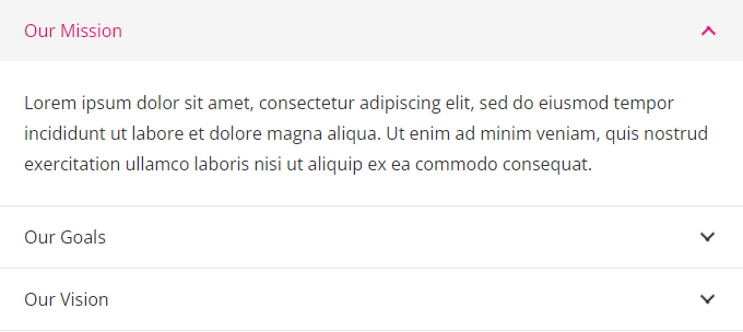
Accordions consist of Sections that you can fill with needed elements, similar to Rows. You can add any elements to Sections, except:
- Vertical Wrappers
- Horizontal Wrappers
- Content Carousel
- Accordions, Tabs, and Vertical Tabs
Accordion Settings #
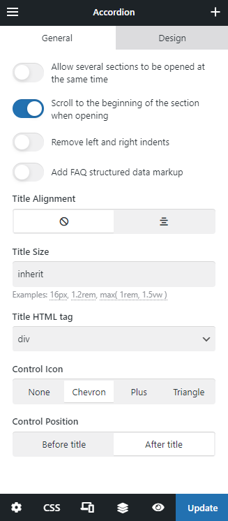
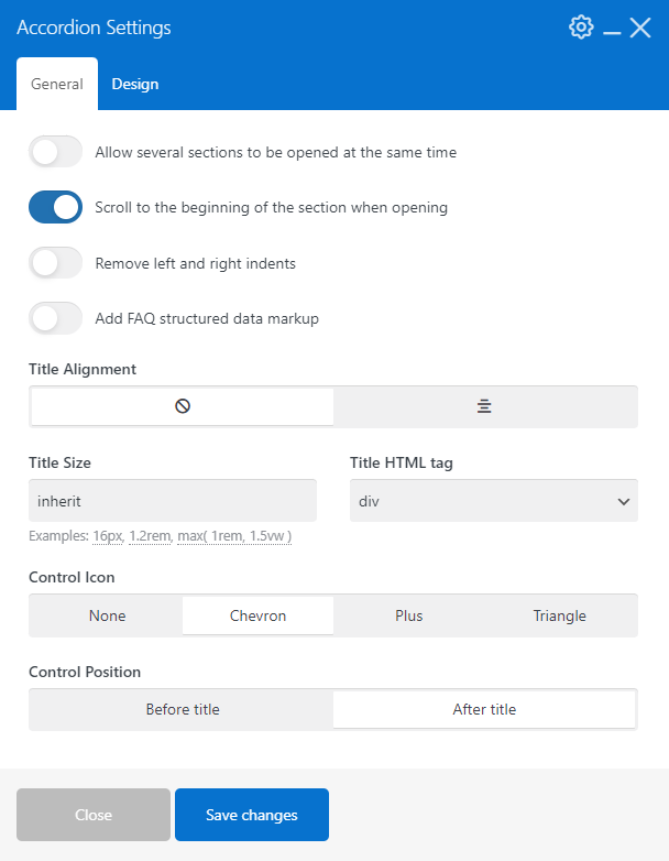
Adjust the Accordion appearance and behavior by using the relevant settings.
Section Settings #
Sections are sub-containers for the content that Accordions, Tabs, and Vertical Tabs use.
Use Section settings to apply custom appearance and behavior.
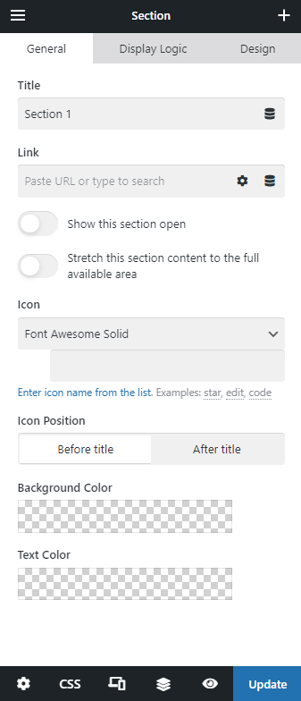
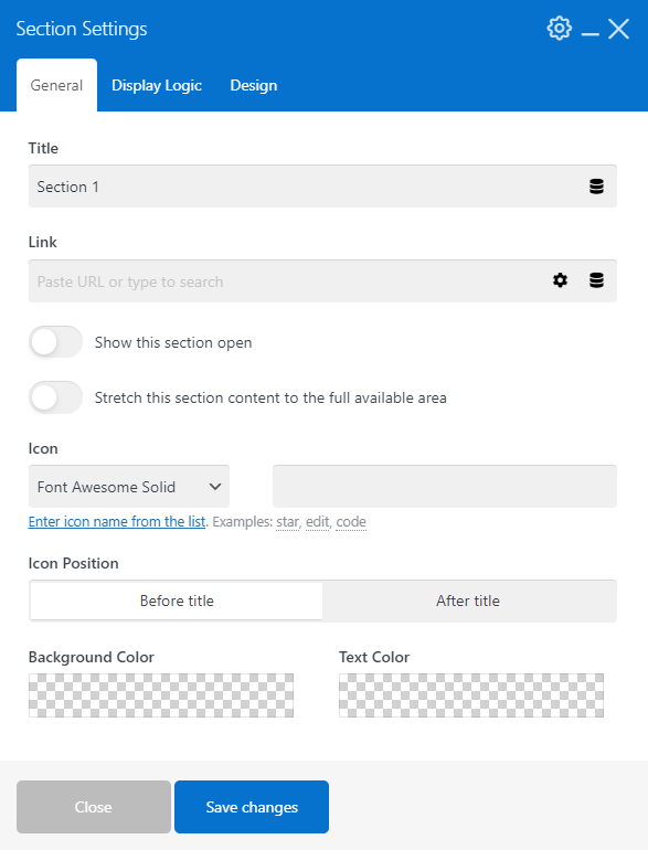
Link - when the link is assigned, clicking on the Section title will redirect to this link instead of opening/closing the section.
Stretch this section content to the full available area - with this switch turned on, the spacing around the content of the section will be removed.
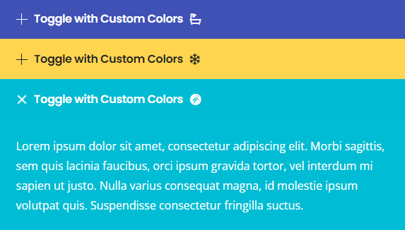
Background Color / Text Color - these color pickers allow specifying the background and text color for specific sections and allow you to apply custom colors per section.
Tabs #
Tabs are container elements that allow you to switch between content sections by horizontal tabs (similar to browser tabs).

Tabs consist of Sections that you can fill with needed elements, similar to Rows. You can add any elements to Sections, except:
- Vertical Wrappers
- Horizontal Wrappers
- Content Carousel
- Accordions, Tabs, and Vertical Tabs
Tabs Settings #
Adjust the appearance and interaction of the Tabs by specifying relevant settings.
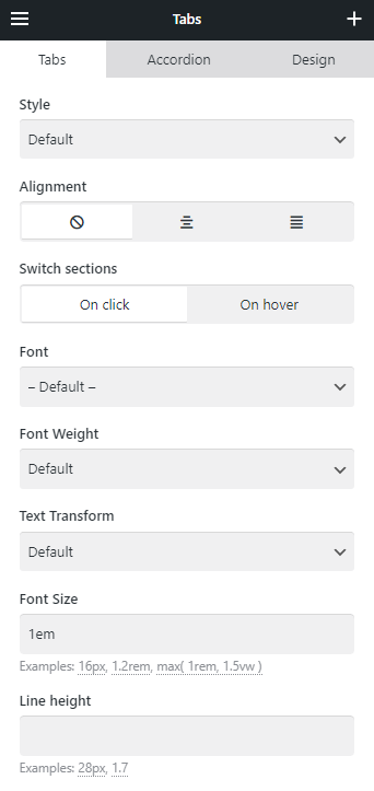
Style - allows choosing one of the pre-designed appearances for the tabs.
Check the few examples of available styles for Tabs:


Depending on the Style you pick, the following colors from Theme Options > Colors will be used inside the element:
- Content color: Primary Content Color
- Content color: Alternate Background
- Content color: Text Color
- Content color: Background
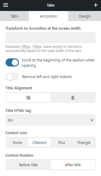
Accordion - on smaller screens, or if the section title is too long, the Tabs element will display as an Accordion. Use the "Accordion" settings to specify its appearance and the width breakpoint via "Transform to Accordion at the screen width."
Section Settings #
Sections and their settings are the same as in Accordion.
The only difference is that Background Color and Text Color will only apply to the content of the tab's Section. The appearance of a tab's title is defined by its style.
Vertical Tabs #
Vertical Tabs are container elements that allow you to switch between content sections by clicking the vertically grouped tabs.
Live examples of Vertical Tabs

Vertical Tabs consist of Sections that you can fill with needed elements, similar to Rows. You can add any elements to Sections, except:
- Vertical Wrappers
- Horizontal Wrappers
- Content Carousel
- Accordions, Tabs, and Vertical Tabs
Vertical Tabs Settings #
Adjust the appearance and interaction of the Vertical Tabs by specifying relevant settings.
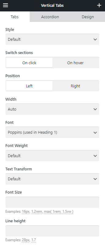
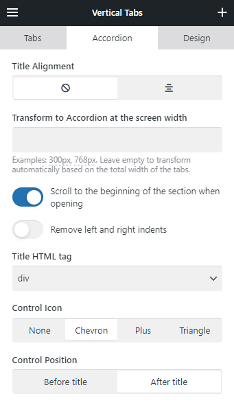
Style - allows choosing one of the pre-designed appearances for the vertical tabs.
Check the few examples of available styles for Tabs:


Depending on the Style you pick, the following colors from Theme Options > Colors will be used inside the element:
- Content color: Primary Content Color
- Content color: Alternate Background
- Content color: Text Color
- Content color: Background
Width - this control specifies which part of the element's width should be taken by the list of titles. Its default "Auto" value will adjust to the titles' length, but you can also specify the exact % value.
Accordion - on smaller screens, or if the section title is too long, the Vertical Tabs element will display as an Accordion. Use the "Accordion" settings to specify its appearance and the width breakpoint via "Transform to Accordion at the screen width"
Section Settings #
Sections and their settings are the same as in Accordion.
The only difference is that Background Color and Text Color will only apply to the content of the tab's Section. The appearance of a tab's title is defined by its style.
FAQ #
How to add "FAQ" structured data markup #
The Accordion element has the relevant option: Add FAQ structured data markup - it adds a question/answer markup to the element's HTML code to improve SEO and show relevant info in search results.
How to Open Specific Sections by URL #
Open the Section's "Design" settings tab and specify "Element ID" for this section, for example, my-section. After this, you can open this section by URL or click on the element with the link: #my-section
How to Use Tabs/Vertical Tabs in Mega Menus #
While creating a Mega Menu, you can use Tabs/Vertical Tabs inside the Reusable Block. The tab title will act as a parent menu element, and the content inside the Section will act as its sub-items.
How to Add Links to the Sections of Tabs/Vertical Tabs #
When editing the Section of Tabs or Vertical Tabs (Tour), you can use the Link field to specify the relevant URL. When specified, clicking on the tab title will trigger the redirect.
Note that it won't work with Accordions and Tabs/Vertical Tabs that switched to an Accordion layout on small screens. Sections of Accordion could only be opened with a click, and using a link inside would make it impossible to open. Tabs and Vertical Tabs can be set up to open on hover and redirect when clicking on the title simultaneously.
