Text Element
Updated 2 years ago
Text Element is used to display a text line. It is available in:
- Live Builder;
- WPBakery Builder;
- Header Builder;
- Grid Layout.
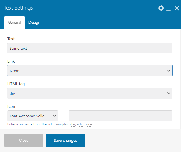
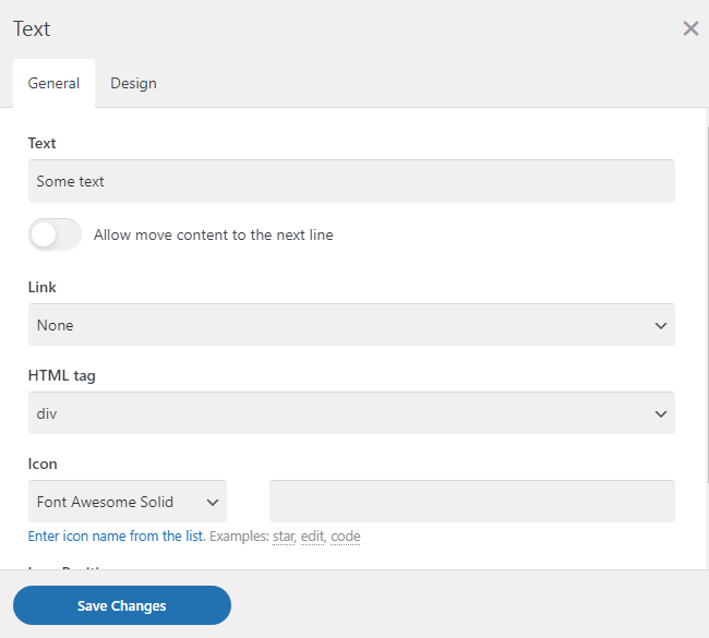
General settings #
- Text — add custom text to the input field ("Some text" by default)
- Link — set custom link with:
- None — the link input field is disabled,
- To a Post — ON/OFF checkbox allows to open link in a new tab
- Clickable value — email, phone, website, ON/OFF checkbox allows to open link in a new tab or hide the element if a link is empty
- Onclick JavaScript action — this option is used to run the script by clicking on a link, ON/OFF checkbox allows to open link in a new tab
- Custom appearance in Grid: Custom Link — the setting of this option is located below the main blocks in the WPBakery Builder, ON/OFF checkbox allows to open link in a new tab
- Testimonial: Author Link — this option provides for assigning a custom link to the author, ON/OFF checkbox allows to open link in a new tab or hide the element if a link is empty
- Custom — any internal or external link, ON/OFF checkbox allows to hide the element if a link is empty. To apply a URL from a custom field, use its name between the {{ }} symbols. Examples: {{custom_field_name}}
- HTML tag — HTML tags are allowed (div, p, span, headers h1-h6, div by default)
- Icon — adding an icon to an IconBox. Enter icon name from the list. Examples: star, edit, code to add custom icon
- Icon Position — set custom icon position as "Before text", "After text"
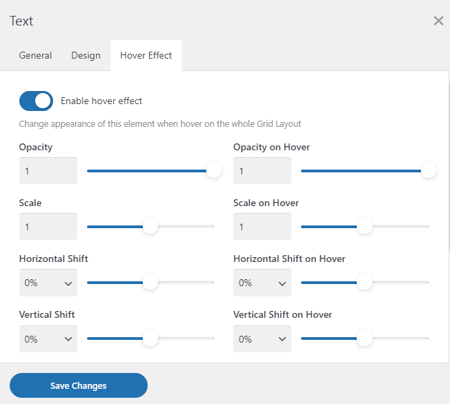
Hover Effect #
ON/OFF slider in Grid Layout Builder allows adding effects:
- Opacity
- Opacity on Hover
- Scale
- Scale on Hover
- Horizontal Shift
- Horizontal Shift on Hover
- Vertical Shift
- Vertical Shift on Hover
- Background Сolor on Hover
- Border Сolor on Hover
- Text Сolor on Hover
- Hover Transition Duration
- Transform origin X
- Transform origin Y parameters
ON/OFF slider in Header Builder allows moving content to the next line.
Design settings #
All Design settings are the same for all elements. Read the article.