Rows and Columns
Updated 4 months ago
When you edit any page with the WPBakery Page Builder or Live Builder, it always has Rows with Columns in the sctructure. It's not possible to add elements (via those builders) without adding them into Row's Columns.
- Every Row always has Columns (at least one)
- Columns can't exist without their Row
Two Systems of Columns Layout #
There are two column-editing systems specific for Live Builder and WPBakery builders, respectively:
- CSS flex layout
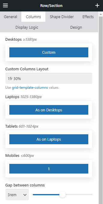
- CSS grid layout (only available for Live Builder)
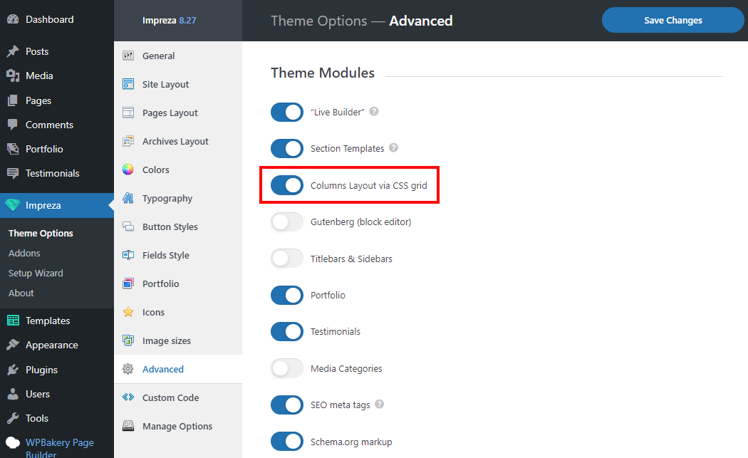
To switch the system for columns go to Theme Options > Advanced and find the "Columns Layout via CSS grid" switch.
Columns Layout via CSS grid (Live Builder related) #
Pros:
- easy to edit columns layout for different screen widths:
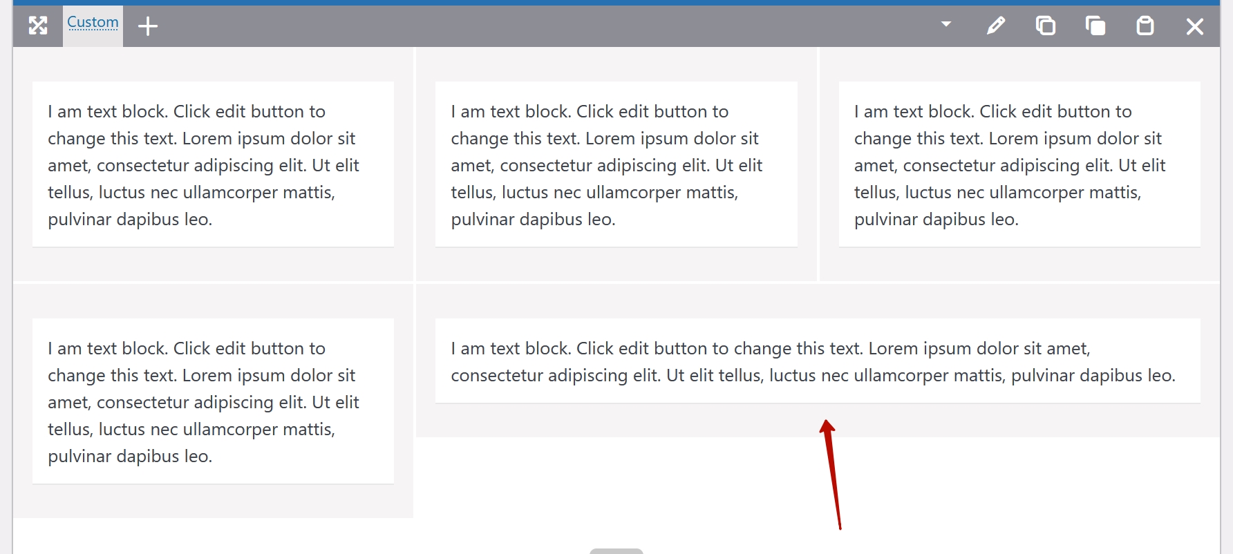
- allows to have any amount of columns in one line (7, 8, 9, 10, 20, etc.)
- allows to have any ratio of column widths in one line (e.g. four columns with 15% 45% 25% 15% widths)
- allows to have flexible layout based on the "grid-template-columns" CSS property
Cons:
- can't be edited with the WPBakery
- columns can't be spanned
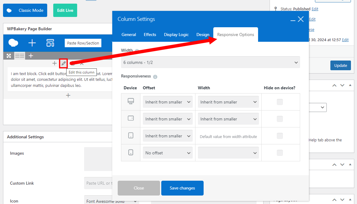
Columns Layout via CSS flex (WPBakery related) #
Pros:
- columns can be spanned (like table cells)
Cons:
- hard to edit columns layout for different screen widths:
- can't allow to have 7, 8, 9, 10 columns in one line
- can't allow to have complex layouts or column width not a multiple of 12
- responsive options can't be edited with the Live Builder
How to equalize column content by height #
If elements inside columns have different heights and you want to equalize them, open the Row > Columns settings and activate the Equal columns content height switch.
Before:

After:
