Colors
Updated 8 months ago
Set up the global colors for the site at Theme Options > Colors.
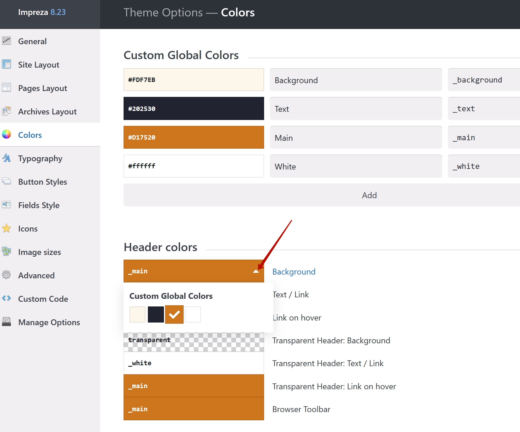
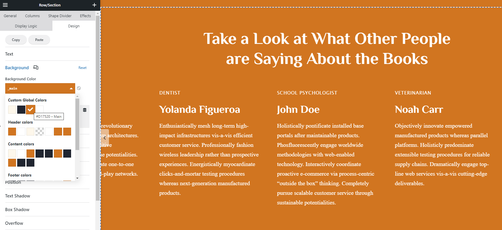
Custom Global Colors #
This is a new tool designed to simplify color management for your site. Custom Global Colors appear in the list of dynamic colors for all color pickers inside Impreza settings and elements. Thus, changing the Custom Global Colors will automatically apply to all color pickers and elements using these colors site-wide.
Check the result of a site with only 4 colors
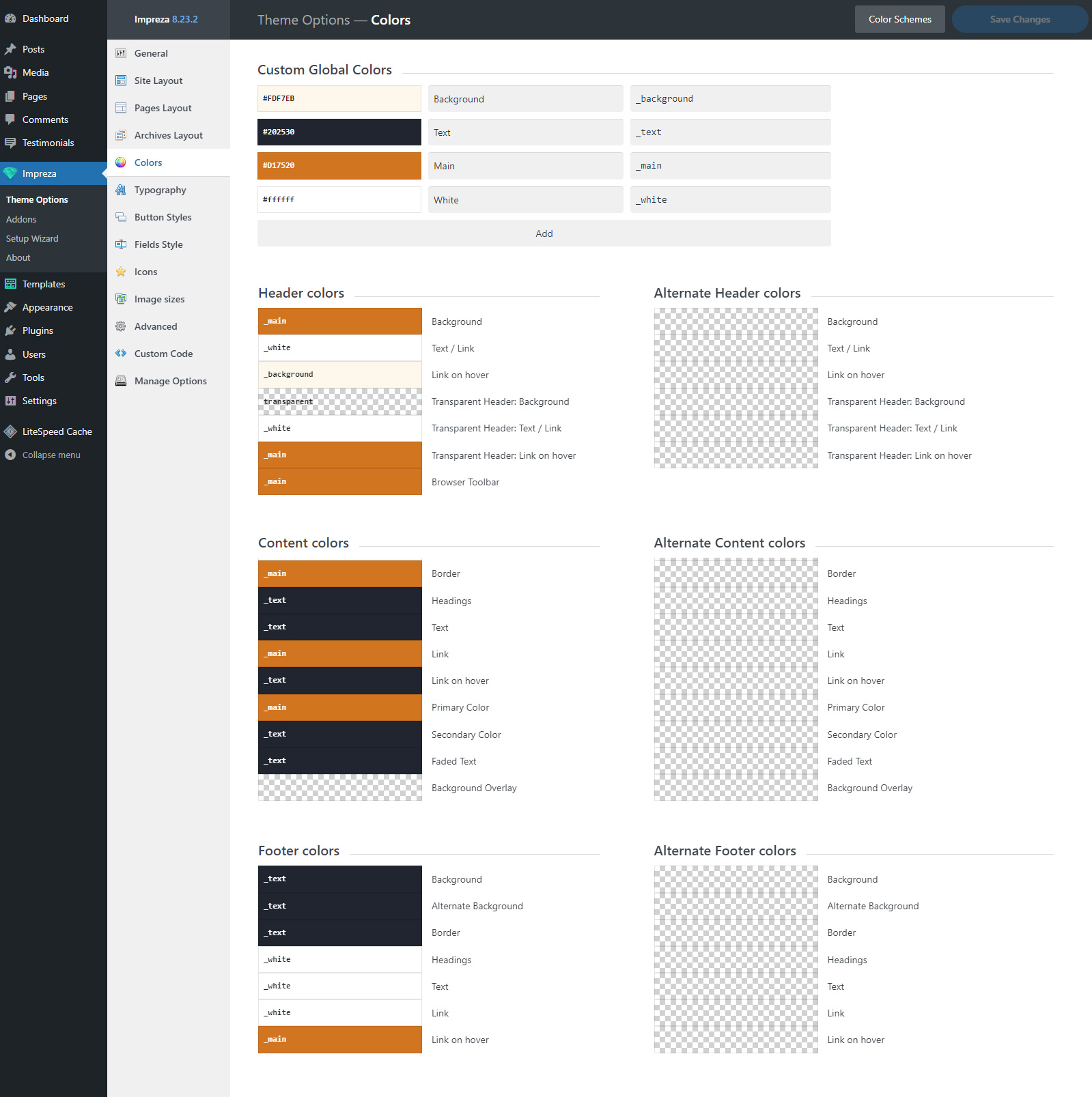
Color Scheme #
Color Scheme is a combination of pre-defined colors. Some of those are used by default by most elements. The other part is optional and might not be used in a site's design (see details below).
Impreza has pre-defined color schemes that you can apply by clicking the Color Schemes button.
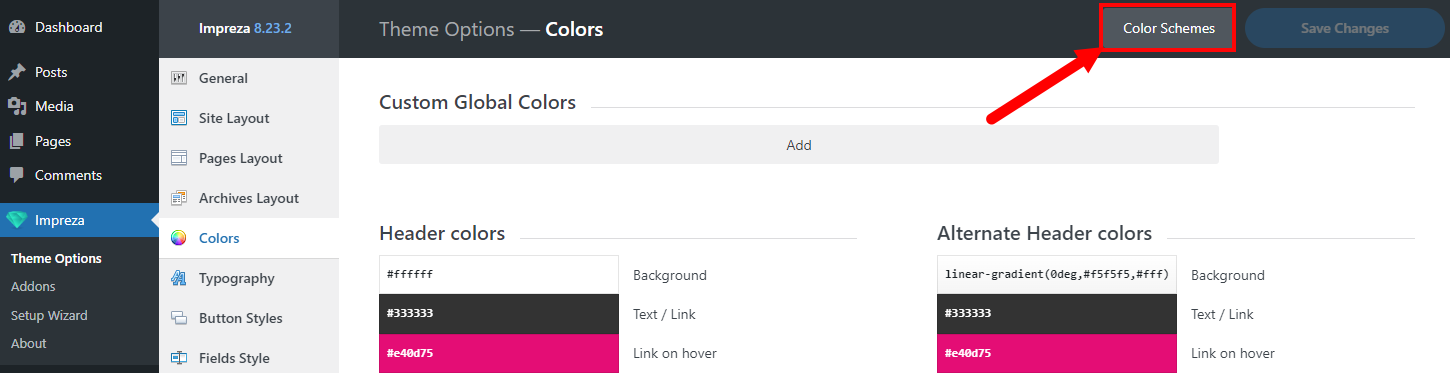
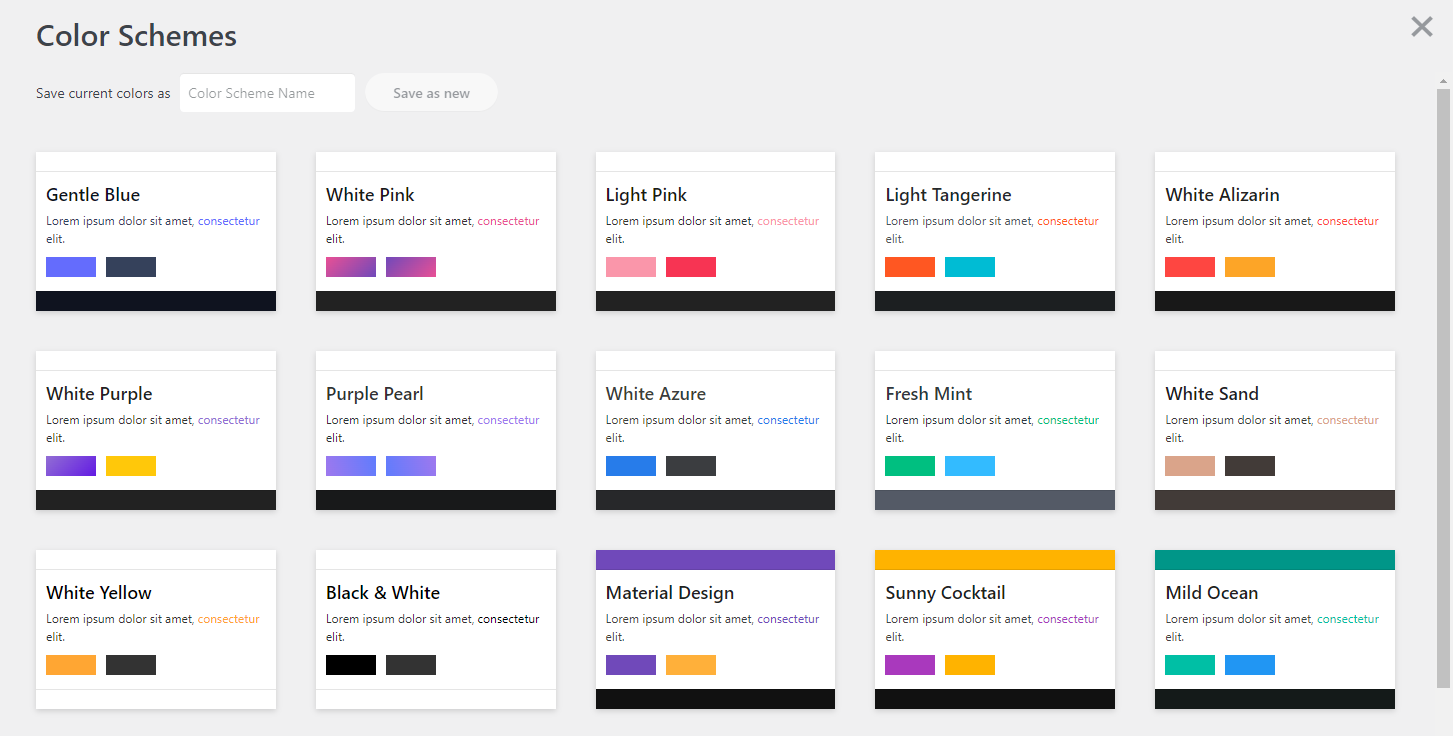
Click on the color scheme applies its colors, replacing previous values from all relevant color pickers. You can also customize the colors and save those as a new color scheme.
The color scheme consists of 49 color pickers broken down into 6 sections.
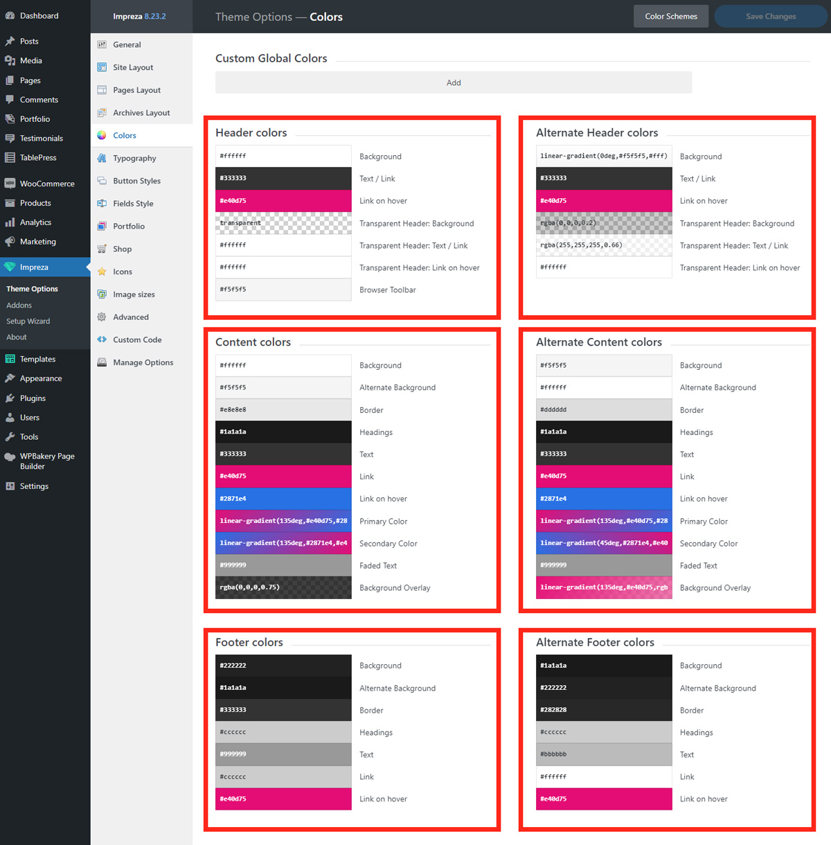
This pre-defined set of color pickers (color variables) was used before the Custom Global Colors implementation and might be simplified in future updates.
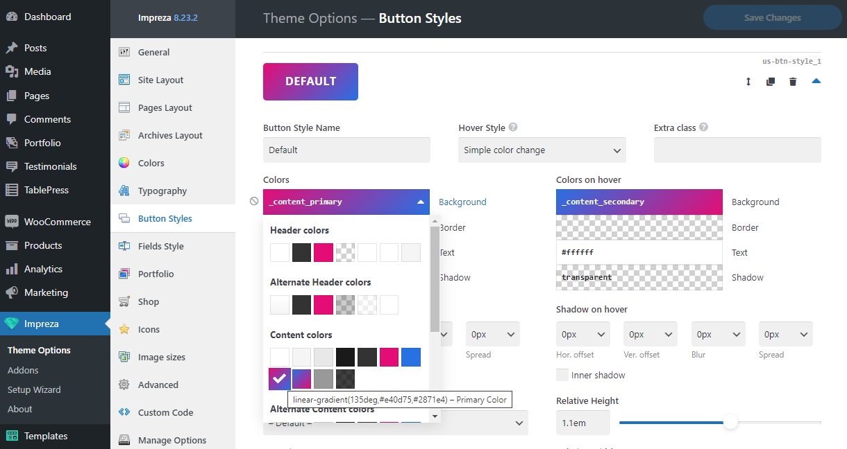
All these colors are available as dynamic colors (similar to Custom Global Colors) that you can apply inside the color pickers of all elements and theme settings. If some colors are not filled (left empty), then they are not displayed in the list of dynamic colors, which can improve usability.
Header Colors #
The colors of this section are applied by default to the Main Area and Bottom Area of a new header you create, and to a Menu element inside the header.
The Browser Toolbar color only applies to the toolbar's background in browsers that support this feature.
When you edit the header, you can rewrite the colors for Main and Bottom Areas and Menu using relevant settings. Thus, colors from the Header Colors section are optional; you can leave their values empty.
Alternate Header Colors #
The colors of this section are applied by default to the Top Area of a new header you create.
When you edit the header, you can rewrite the colors for the Top Area using relevant settings. Thus, colors from the Alternate Header Colors section are optional; you can leave their values empty.
Content Colors #
Colors from this section are the core colors for the site's design.
Background
This color is used for:
- Pages background,
- Popups background,
- Preloader Screen background (if it's active at Theme Options > General).
- Cookie Notice background (if it's active at Theme Options > General).
- Contact Form element - background of the dropdown list.
- Dropdown element - background of its list.
- Grid Filter element - in multiple elements, depending on its layout.
- IconBox element - in its Appearance settings for Icon Color.
- Map element - for the background of the Marker Text block.
- Pricing Table element - items background.
- Search element - default value for the Search Field Background.
- Tabs / Vertical Tabs elements - current tab's background.
- Background for multiple Grid Layout Templates.
- Styling of several elements of the bbPress, Gravity Forms, WooCommerce, WooCommerce Multi Currency, and WPML plugins.
Alternate Background
This color is used for:
- Background of the code-formatted text ( <pre>, <code>) inside Text Blocks.
- Background of the site's body (if the second option is active at Theme Options > Site Layout > Site Canvas Layout).
- Default background color for the input fields at Theme Options > Fields Style
- Default background color for the "No results found" message inside the Grid and List elements.
- ActionBox element's background (if the "Alternate bg & Content text" option is set at its General > Colors settings)
- Carousel element - arrows background on hover.
- Contact Form element - date's background on hover.
- FlipBox element - default Background Color for the Front Side.
- Grid Filter element - several elements, depending on the layout.
- Interactive Banner element - default background.
- Pricing Table element - background of sub-items.
- Progress Bar element - background of an empty part of the bar and progress value (for Appearance > Style 3)
- Social Links element - items background (for the Appearance > Icons Style > Solid)
- Tabs / Vertical Tabs elements - tab background for some layouts.
- Custom Menu widget - menu item background on hover.
- Background for multiple Grid Layout Templates.
- Background on hover for the Numbered Pagination inside Grid elements.
- Styling of several elements of the bbPress, Gravity Forms, WooCommerce, WooCommerce Multi Currency, and WPML plugins.
Border
This color is used for:
- Table borders (<table>) inside the Text Blocks.
- Horizontal line (<hr>) inside the Text Blocks.
- Columns border color (if the Border Style is specified in its Design > Border settings).
- Accordion element - separator lines between items.
- FlipBox element - default Background Color of the Back Side.
- Grid Filter element - several sub-items color, depending on the layout.
- IconBox element (if specified at Appearance > Icon Color)
- Image element - border color for the Image Style > Outlined.
- Post Custom Field element - table borders color (for the ACF Repeater fields set up to show in a table).
- Pricing Table element - items border color.
- Separator element - line color (if the "Show horizontal line in the middle" is active and the Line Color is set to "Border").
- Sharing Buttons element - item's border color.
- Social Links element - item's border color (if the Appearance > Icons Style is set to "Outlined").
- Tabs / Vertical Tabs elements - separator lines color for several styles.
- Custom Menu widget - separator lines color between menu items.
- Color of several elements inside the Grid Layout Templates.
- Dashed line color for the comments of level 2 and higher.
- Styling of several elements of the bbPress, Gravity Forms, WooCommerce, WooCommerce Multi Currency, and WPML plugins.
Headings
This color is used for:
- Default text color for all headings (<h1> - <h6>).
- Counter element (if the General > Color is set to "Heading").
- Progress Bar element - filled bar color (if the Appearance > Progress Bar Color is set to "Heading").
- Tabs / Vertical Tabs elements - tabs text color (for the "Simple 3" Style).
- Color of several elements inside the Grid Layout Templates.
- Styling of several elements of the WooCommerce and WooCommerce Multi Currency plugins.
Text
This color is used for:
- Default text color sitewide.
- Popups text color.
- Cookie Notice text color (if it's active at Theme Options > General).
- Default text color for the "No results found" message inside the Grid and List elements.
- Contact Form element - text color of the Date field dropdown.
- Dropdown element - text color of the dropdown list.
- Grid Filter element - the color of several elements, depending on the layout.
- IconBox element (if specified at Appearance > Icon Color)
- Map element - text blocks color inside the active marker.
- Progress Bar element - progress value text color for Style 3.
- Search element - default text color for the input field.
- Tabs / Vertical Tabs elements - tabs text color for several styles.
- Color of several elements inside the Grid Layout Templates.
- Styling of several elements of the WooCommerce and WooCommerce Multi Currency plugins.
Link
This color is used for:
- Default links color sitewide.
- Grid Filter element - the color of several elements, depending on the layout.
- Social Links element - items color on hover (for the "Colored" Style).
- Color of some elements of Grid Layout Templates.
- Styling of some elements of the TablePress plugin.
Link on hover
This color is used for:
- Default links color on hover, sitewide.
- Grid Filter element - the color of several elements, depending on the layout.
- Color of some elements of Grid Layout Templates.
Primary Color
This color is used for:
- Interactive elements highlight on focus (if the "Keyboard Accessibility" is active at Theme Options > General).
- Back to top button background on hover (If "Back to Top Button" is active at Theme Options > General).
- Navigation button color on hover (button to show/hide vertical header on mobiles and tablets).
- Row/Section element - background color (if the Row Color Style is set to "Primary bg & White text").
- Preloader element color (appears when Grid elements items are loading with pagination or if the "Preloader Screen" is active at Theme Options > General)
- Accordion element - active section title color.
- ActionBox element - background color (if the Colors setting is set to "Primary bg & White text").
- Carousel element - navigation dots color.
- Contact Info element - icons color.
- Contact Form element - active date background inside the date field dropdown.
- Counter element - counter color (if the Color setting is set to "Primary").
- Grid element - built-in filter elements color.
- Grid Filter element - the color of several elements depending on the layout.
- IconBox element - icon color (if the Appearance > Icon Color is set to "Primary").
- Image element - phone mockup border color (if the Image Style is set to "Phone 12 Flat").
- Image Slider element - the color of the navigation dots and active thumbnail (if the Additional Navigation is set to "Dots" or "Thumbnails").
- Person element - social links background color on hover.
- Progress Bar element - bar color (if the Appearance > Progress Bar Color is set to "Primary").
- Separator element - line color (if the "Show horizontal line in the middle" is active and the Line Color is set to "Primary").
- Sharing Buttons element - items color (if the Colors setting is set to "Primary").
- Social Links element - color of the items on hover.
- Post Taxonomy element - background color (if the "Display as" is set to "Button" and the Button Style is set to "Badge by default").
- Post Image element - navigation elements color (if the "Show media preview" is active).
- Post Prev/Next Navigation element - navigation background on hover (if the Layout is set to "On sides of the screen").
- Pricing Table element - the featured element highlight.
- Tabs / Vertical Tabs elements - current tab highlight and several elements color (depending on the layout).
- Custom Menu widget - active menu item color.
- Color of multiple elements in Grid Layout Templates.
- Numbered pagination - current page's color.
- Post Comments element - name color of the post author.
- A background color brightened by 85% on tap to interactive elements (buttons, links) for touch screens. Defined globally at "-webkit-tap-highlight-color: var(--color-content-primary-faded)".
- Color of the custom CSS classes "highlight_primary" and "highlight_primary_bg"
- Styling of several elements of the bbPress, Gravity Forms, WooCommerce and WooCommerce Multi Currency plugins.
Secondary Color
This color is used for:
- Row/Section element - background color (if the Row Color Style is set to "Secondary bg & White text")
- ActionBox element - background color (if the Colors setting is set to "Secondary bg & White text").
- Counter element - counter color (if the Color is set to "Secondary").
- IconBox element - icon color (if the Appearance > Icon Color is set to "Secondary").
- Progress Bar element - bar color (if the Appearance > Progress Bar Color is set to "Secondary").
- Separator element - line color (if the "Show horizontal line in the middle" is active and the Line Color is set to "Secondary").
- Sharing Buttons element - items color (is the Colors settings it set to "Secondary").
- Post Taxonomy - background color on hover (if the "Display as" is set to "Button" and the Button Style is set to "Badge by default").
- Color of the custom CSS classes "highlight_secondary" and "highlight_secondary_bg".
Faded Text
This color is used for:
- A quote symbol color of the blockquote.
- Contact Form element - field description text color.
- Post Author element - author's site text color.
- Social Links element - custom link's color.
- Tag Cloud and Product Tag Cloud widgets - links color.
- Color of some elements of Grid Layout Templates.
- Color of the "highlight_faded" custom CSS class.
Background Overlay
This color is not assigned to anything by default.
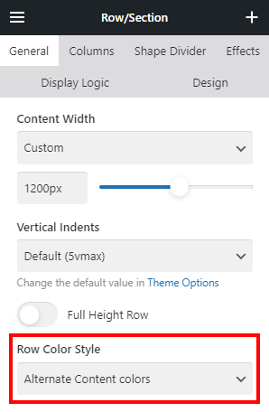
Alternate Content Colors #
By default, this section's colors are used for the Row/Section elements, with the Row Color Style set to "Alternate Content Colors."
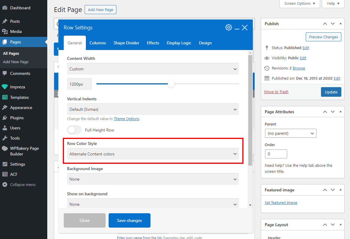
You can leave these color pickers empty, as sections of the site with the "Alternate Content Colors" style are not mandatory, and you can skip using them if they are not needed.
Footer Colors #
By default, this section's colors are used for the Row/Section elements, with the Row Color Style set to "Footer Colors."
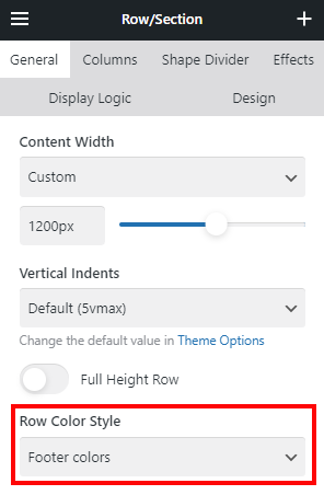
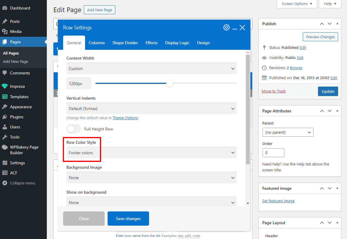
You can re-assign colors for the footer or skip using the footer on your site. Thus, all color pickers in this section are not mandatory; you can leave them empty.
Alternate Footer Colors #
By default, this section's colors are used for the Row/Section elements, with the Row Color Style set to "Alternate Footer Colors."
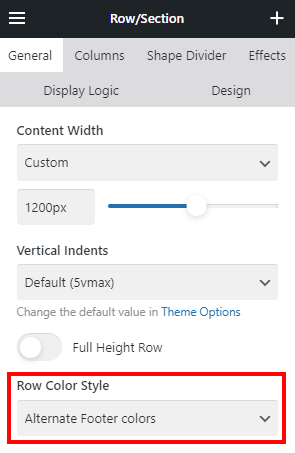
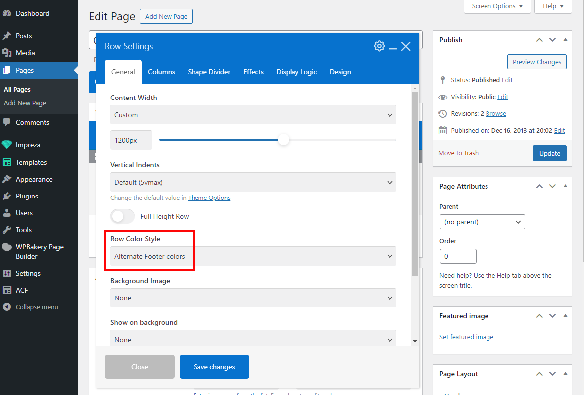
You can re-assign colors for the footer or skip using the footer on your site. Thus, all color pickers in this section are not mandatory; you can leave them empty.
Dark Mode #
There are two different ways to enable dark mode on Impreza website:
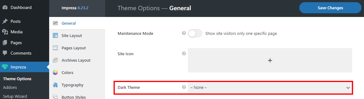
Via the "Dark Theme" global option #
In this method, the website's colors switch depending on the visitor's devices or browsers.
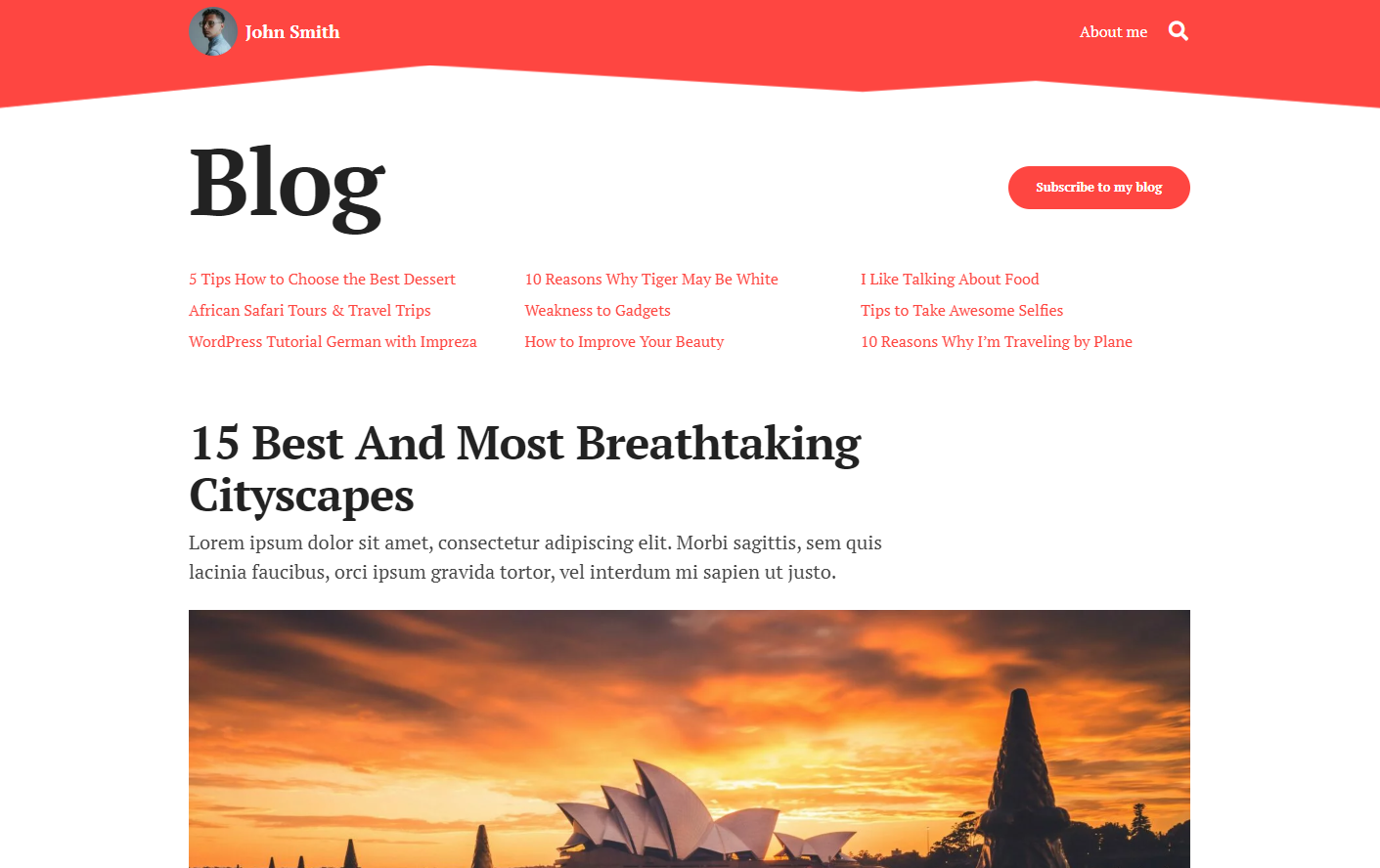
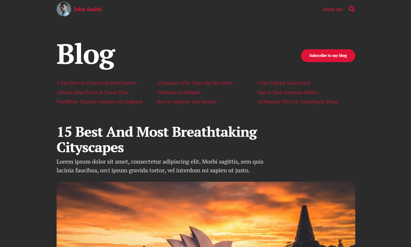
If dark mode is enabled on a visitor's device, the website will use the colors from the color scheme selected at Theme Options > General > Dark Theme:
Check the Impreza website with the Dark Theme enabled. Change the color mode of your device (desktop, laptop, tablet, mobile phone) and see how this site changes its colors too.
- Open the needed Header (Templates > Headers) and add two different images for the logos of the light and dark color schemes.
- In the image Design settings, add custom CSS classes: logo-light and logo-dark, respectively.
- Go to Impreza > Theme Options > Custom Code page and add the following code to the Custom CSS box there:
.logo-light { display: block; }
.logo-dark { display: none; }

@media (prefers-color-scheme: dark) {
.logo-light { display: none !important; }
.logo-dark { display: block !important; }
}
Color Scheme Switch #
This element allows site visitors to manually change the site's colors to a predefined color scheme.
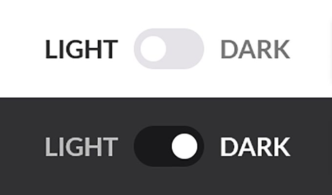
Live examples:
When a visitor clicks the switch, their choice will be remembered by the browser for 30 days.
If there are multiple color scheme switches on a page, they will switch simultaneously, but only the color scheme from the first element will be used.
You can add the Color Scheme Switch to a page template, header, or footer.
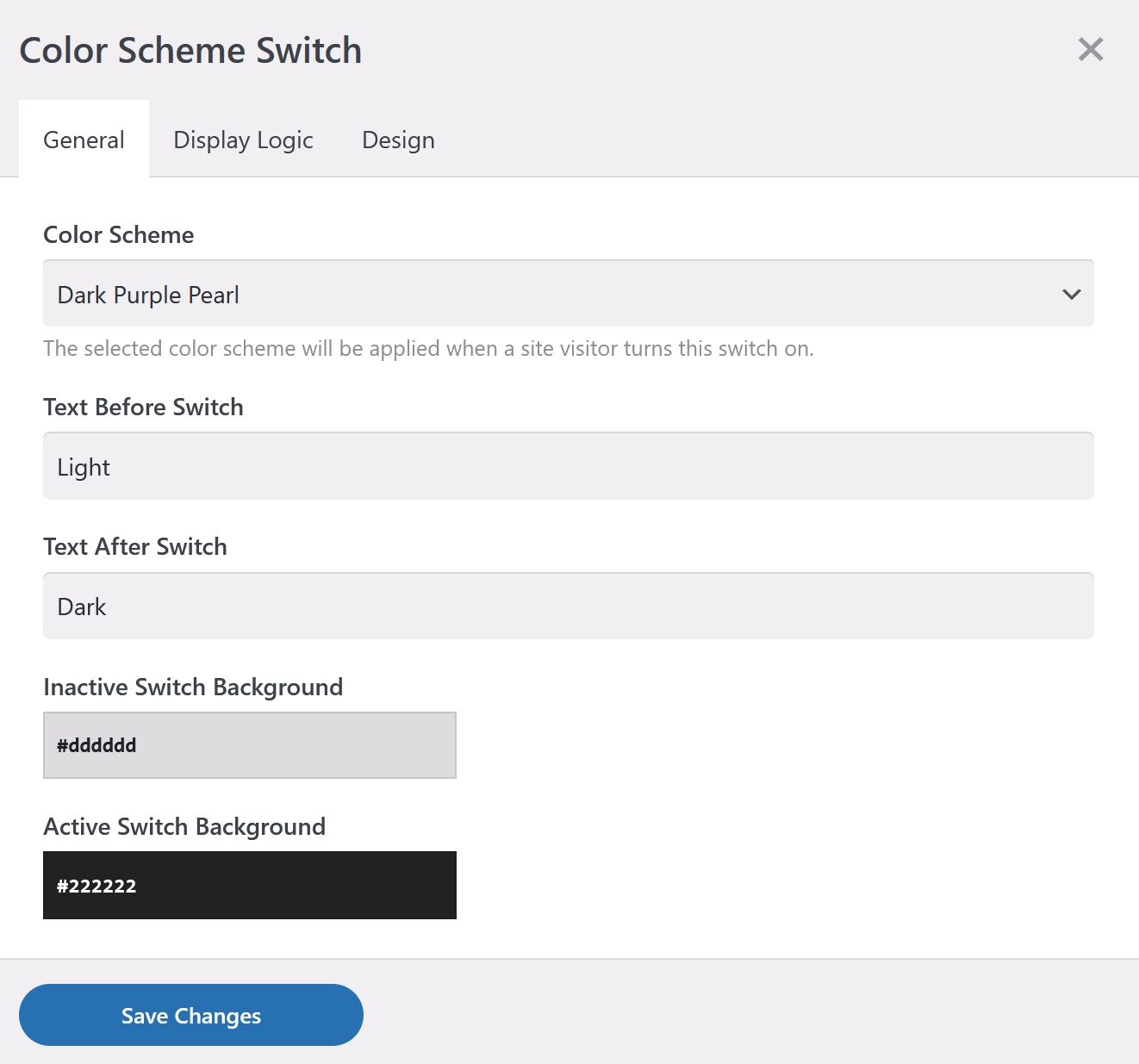
Use the Design Settings tab to customize appearance of the switch.
If you add the Color Scheme Switch to your site, make sure you set the Theme Options > General > Dark Theme to the "None" to avoid possible colors conflict.