Site Layout
Updated 7 months ago
Site Canvas Layout #
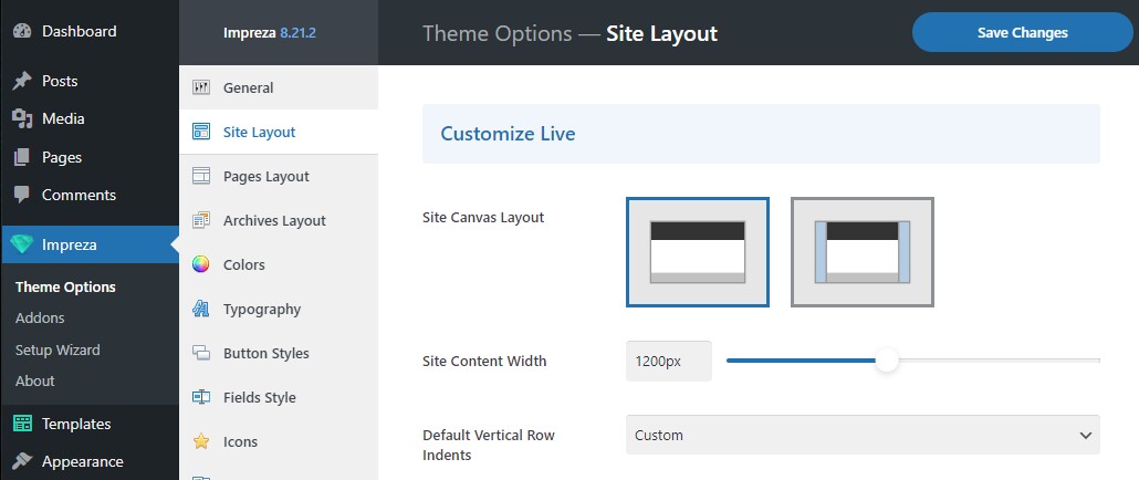
Allows choosing a layout for the canvas of the site header, content, and footer:
Wide – with this layout, the background of the header, content, and footer will take the full available width of the screen.
Boxed – with this layout, the header, content, and footer will have limited width, and the colored background or a background image will take up the rest of the available space.
When you pick the Boxed layout, the listed settings become available:
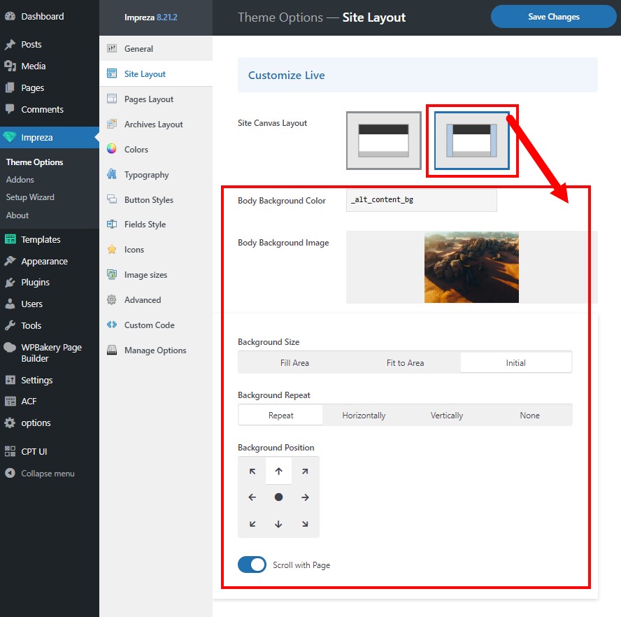
Body Background Color #
The background color that appears behind the site header, content, and footer.
Body Background Image #
The background image that appears behind the site header, content, and footer.
It has controls to specify the Body Background Image behavior:
- Background Size – defines if the image should fill the area, fit the area, or use its original size.
- Background Repeat – defines if the image should repeat itself if it's not covering the entire screen area.
- Background Position – defines the anchor for the Body Background Image positioning.
- Scroll with Page – defines the Body Background Image behavior on scroll. When it's turned on, the image will fit the full page content height and will scroll with it. When it's turned off, the image will fit the screen size and will remain static as you scroll the page content.
Site Canvas Width #
The maximum site canvas width, which is available for the "boxed" layout only.
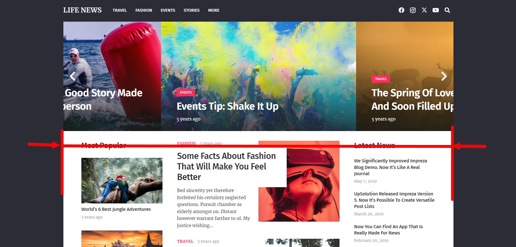
Site Content Width #
The maximum site content width. This value can be customized separately for every Row/Section element in its settings.

Sidebar Width #
The width of the content's sidebar.
This option is only available when the Titlebars & Sidebars module is active at Theme Options > Advanced > Theme Modules
Default Vertical Row Indents #
Set the default Row Height value for all Row/Section elements sitewide.
Bottom Indent of Text Blocks #
Adds default spacing after the Text Block elements sitewide.
Footer Reveal Effect #
Enable Footer Reveal Effect. Check the example.
Animations Disable Width #
When screen width is less than this value, the following options are disabled:
- Parallax effects of background images in Row/Section elements;
- The animations from the Design settings of all elements;
- The Scrolling Effects from the Effects settings of all elements;
- The ability to open posts in a popup inside Grid and Product List elements.
Columns Stacking Width #
Applies mobile device styling features when the screen width equals or is less than this value.
- All columns inside the Row/Section appear in a single-column layout;
- Footer Reveal effect switches off, swapping to a regular page scroll behavior;
- Disables sticky behavior on scroll for the Row/Section and Columns;
- Stacks Sidebars in a single-column layout with the content area.
Laptops Screen Width #
When the screen width is less than this value and higher than “Tablets Screen Width”, the element uses styles from its Laptops tab of Design settings.
Tablets Screen Width #
When the screen width is less than this value and higher than the "Mobiles Screen Width", the element uses styles from its Tablets tab of Design settings.
Mobiles Screen Width #
When the screen width is less than this value, the element uses styles from its Mobiles tab of Design settings.