Global Styles
Updated 5 months ago
Preloader Screen #
A loading screen that site visitors see while the page content is not fully loaded. It's commonly used to prevent interactions with the page content until it's ready.
At Theme Options > General, choose one of the pre-designed Proloader Screen templates or use a custom image.
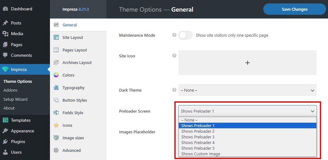
Note that using a preloader screen lowers the site's SEO performance and score.
Rounded Corners #
It defines the baseline approach to the design of shapes and figures used in elements site-wide. Apply Rounded Corners to theme elements at Theme Options > General.
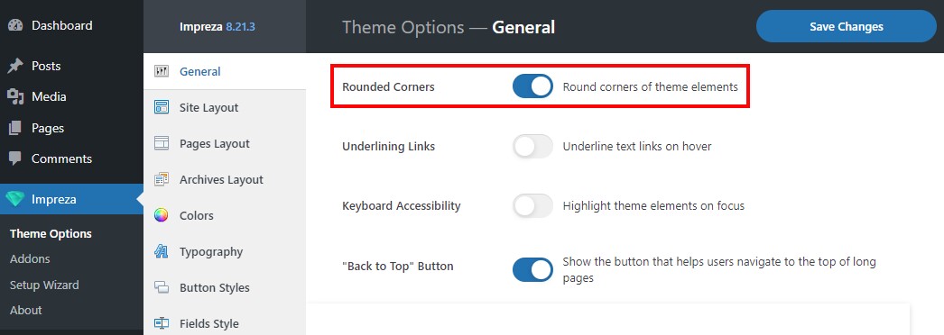
When deactivated, shapes inside the elements will use sharp corners instead.
Underlining Links #
A global setting to emphasize the text links site-wide by adding an underline effect. Activate it with the Underlining Links switch at Theme Options > General.
When activated, the underline effect applies to all text links site-wide. Check live examples: Example 1, Example 2, Example 3.
You can use relevant settings from "Line options by default" and "Line options on hover" to customize the underline effect for the links' default, hover, or both states.

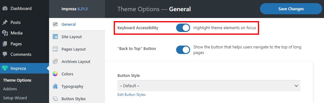
Keyboard Accessibility #
A special mode that highlights the currently focused element of page content or navigation. It simplifies site browsing via the keyboard only.
Activate the Keyboard Accessibility at Theme Options > General.
Button Styles #
At Theme Options > Button Styles you can add/edit styles for buttons on your site. These styles will be applied to the relevant content elements that include a button in their layout.
The Button Style selection is available for:
- Theme Options > General > "Back to top" Button — assigned at Theme Options > General.
- Theme Options > General > Cookie Notice — a cookie consent button, assigned at Theme Options > General.
- Theme Options > Shop > Primary Buttons Style and Secondary Buttons Style — styles applied to your WooCommerce shop, including add to cart button, cart, and checkout navigation buttons, discount code submit button, order confirmation button, and others.
- Button element.
- Carousel element (prev/next navigation arrows style).
- Cart Page - Totals element.
- Contact Form element.
- Checkout Page - Payment element.
- Coupon form element.
- Action Box element.
- FlipBox element.
- Grid/Carousel element ("show more" button).
- Popup element (with the button trigger).
- Post taxonomy element (when its style is set to "display as > button").
- Pricing Table element.
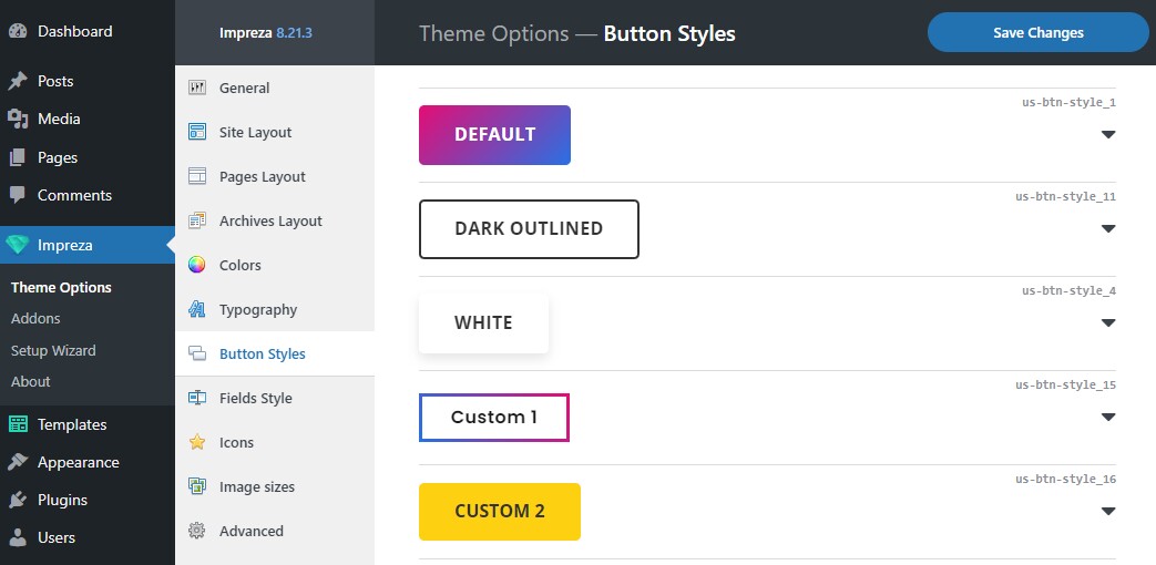
Click on a button preview to expand its settings:
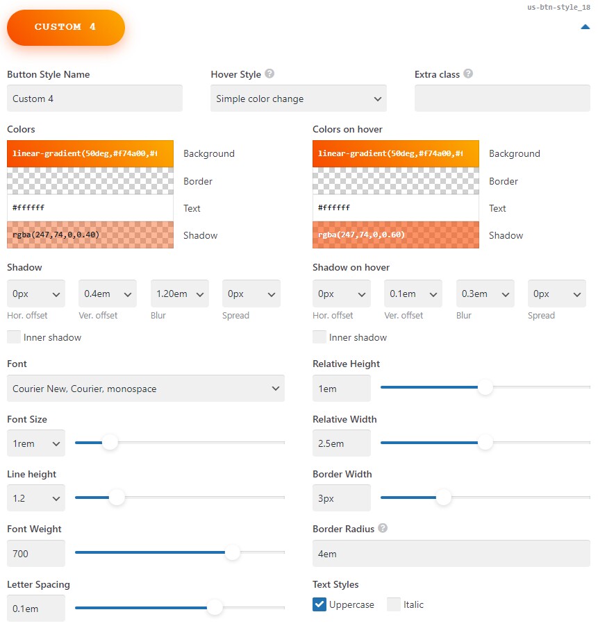
Every button has a default CSS class on the right. You can use it or add your custom Extra Class to apply some extra styling via CSS.
Default Button Style #
The first style is always used as the "default" style, which is applied to:
- Custom or third-party buttons when they don't have their styling.
For example: if you add a custom HTML button with <button>My button</button>, it will use the default button style. - Buttons of the elements after removing the previously selected button style.
For example: if you delete all Button Styles except one, all buttons on your website will use that remaining style.
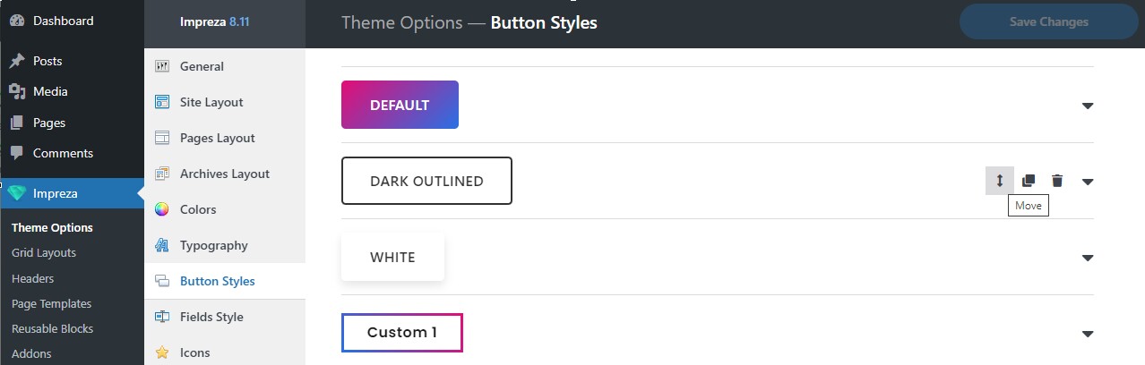
If you move another button style to the first position in the list, it will become a new default style. You can reorder the list of button styles with drag and drop:
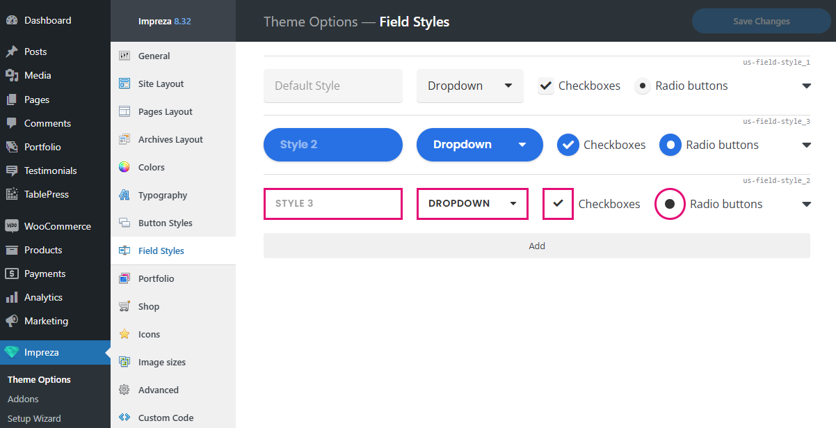
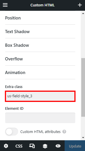
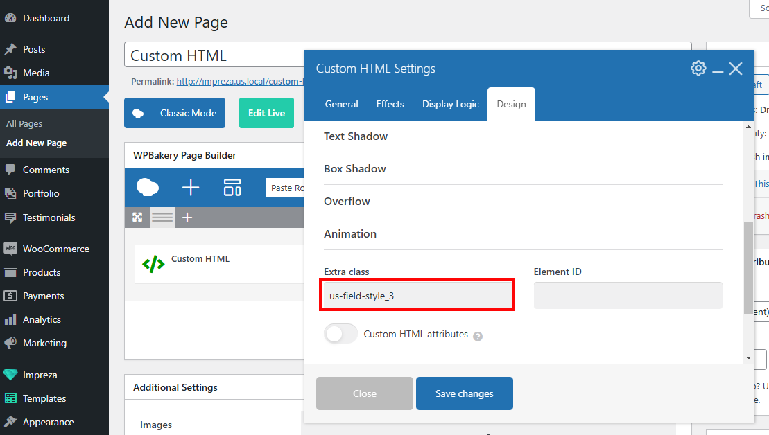
Field Styles #
At Theme Options > Field Styles, you can add/edit styles for input fields on your site.
Click the arrow on the right to open the field style settings:
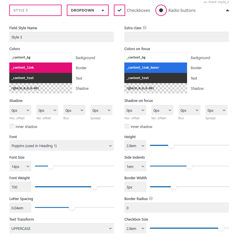
Every field style has a unique CSS class showing on the right. You can use it or add your custom Extra Class to apply extra styling via custom code.
Default Field Style #
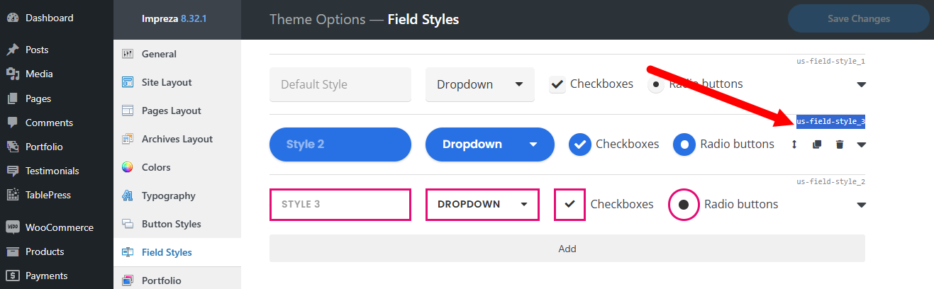
The first style in the list is always used as the default one, which applies to:
- all fields provided by third-party plugins
- fields that used the removed field style
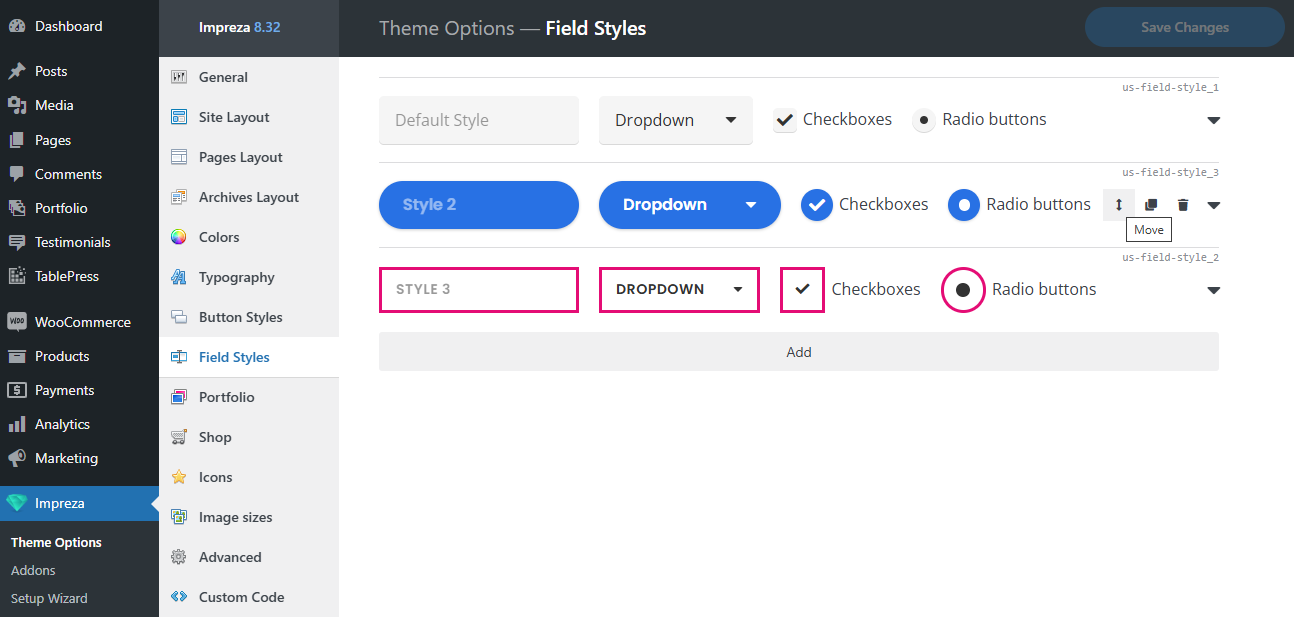
If you move another style to the first position in the list, it will become a new default style. You can reorder the list of styles with drag and drop.
How to apply a Field Style? #
The Field Styles selection is available in the following elements:
- Contact Form
- Search
- Login
- List Filter
- List Order
- List Search
- Grid Filter
- Grid Order
- Checkout Page – Billing (WooCommerce related)
- Checkout Page – Payment (WooCommerce related)
- Checkout Page – Login (WooCommerce related)
- My Account Page – Login (WooCommerce related)
- Coupon Form (WooCommerce related)
- Contact Form 7 ("Contact Form 7" plugin related)
- Gravity Forms ("Gravity Forms" plugin related)
If you want to apply the field style for an element not from the list above, you can use the relevant CSS class.
All input fields inside the element with this CSS class will use the relevant style.