Grid Layouts
Updated 2 months ago
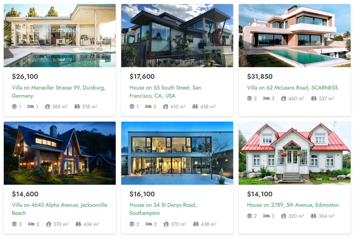
Grid Layout is a customized design for items listed inside the following elements:
- Post List / Post Carousel
- Product List / Product Carousel
- Term List / Term Carousel
- User List
- Grid / Carousel (deprecated)
Grid Layout Builder #
This is a drag-and-drop builder for creating custom-designed Grid Layouts. Add elements by pressing the plus icon and move, duplicate, reorder, and edit them as you like.
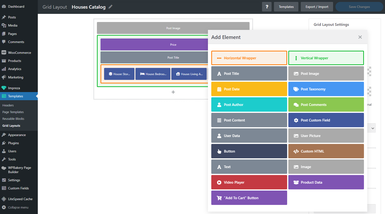
Along with regular elements, Grid Layout allows adding:
- Post Taxonomy – element for showing terms of any needed taxonomy, including custom taxonomies (created via CPT UI plugin).
- Post Custom Field – element for showing custom fields added with the Advanced Custom Fields plugin and fields specified at the "Additional Settings" data block.
- Product Data – WooCommerce-specific element that allows you to show specific properties and data about a product. You can add it multiple times to show product size, price, stock status, list of attributes, etc.
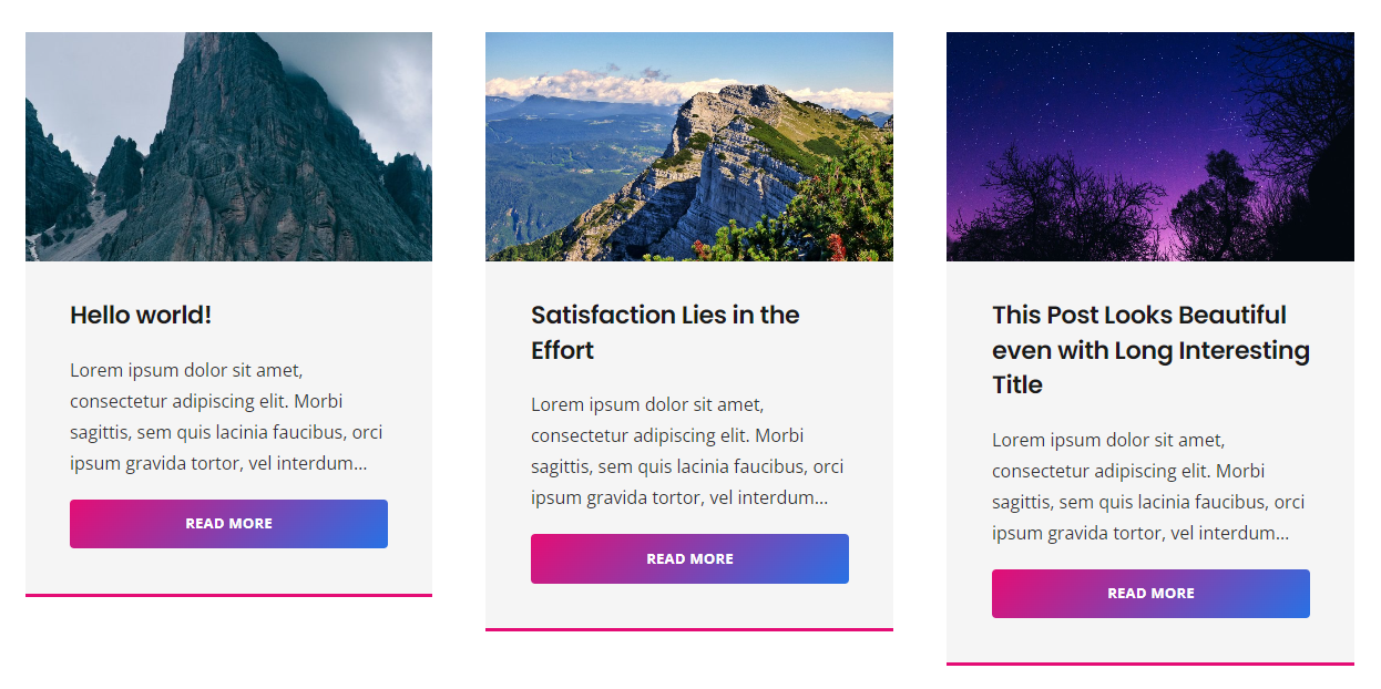
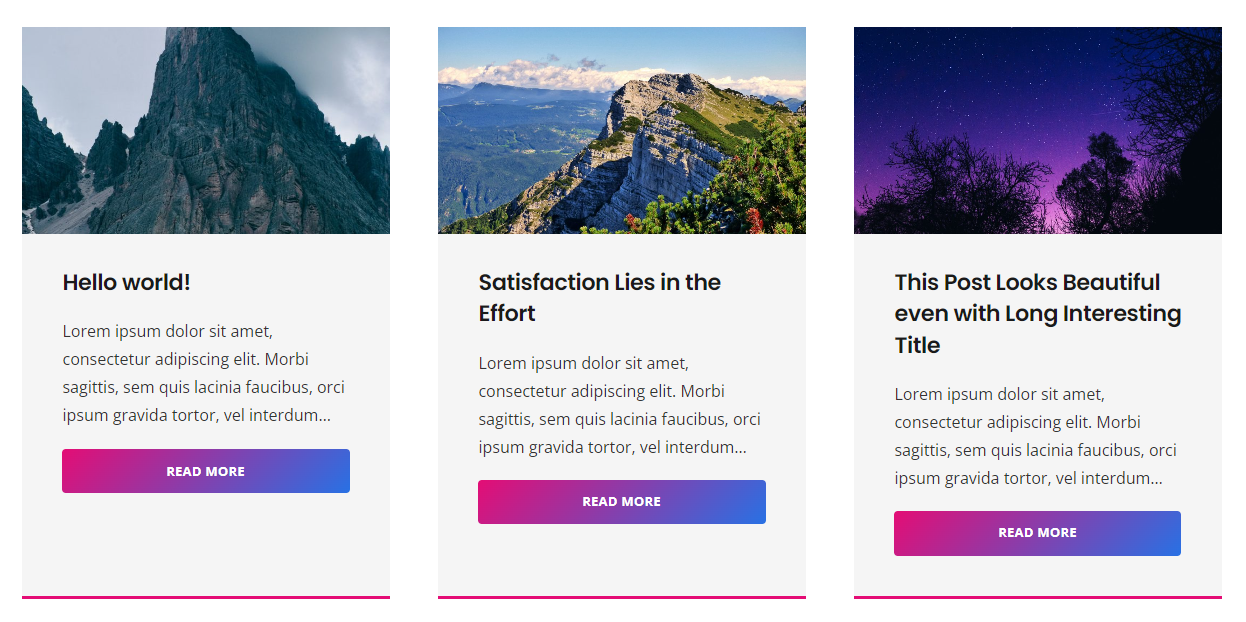
Grid Layout Templates #
A library of the pre-designed templates for Grid Layouts. Press the Templates button to view templates and click a template to import its layout and settings.
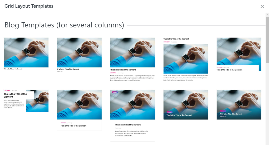
Check live examples of all the listed Grid Layout templates at https://impreza.us-themes.com/grid-templates/.
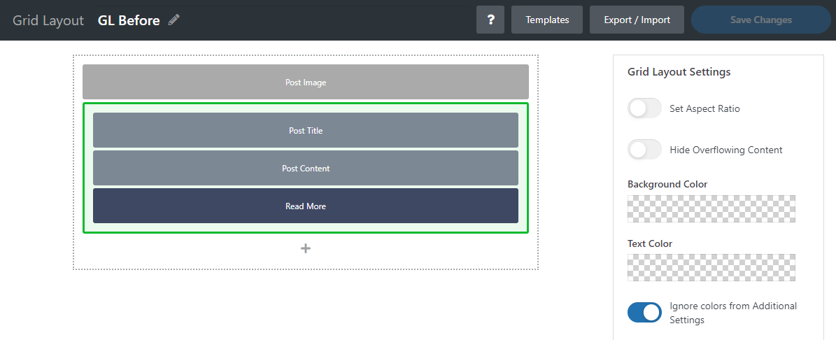
Grid Layout Settings #
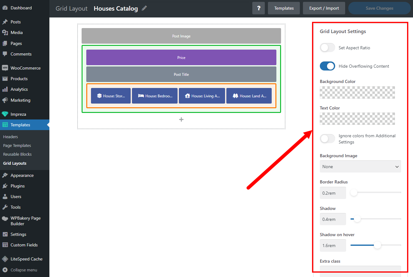
A set of settings to customize an item's appearance in the list:
- Set Aspect Ratio – allows the item's width-to-height ratio to be set, including pre-defined and custom ratios.
- Hide Overflowing Content – allows to hide parts of the elements that go beyond the item's canvas. Some elements might overlap the canvas borders due to custom positioning and hover animations (described below).
- Background & Text Color – allows setting up the background and text colors for the item. It supports static color values and dynamic values from Theme Options > Colors.
- Ignore Colors from Additional Settings – a switch that allows overwriting the colors specified in "Additional Settings" with those specified in Grid Layout Settings.
- Border Radius – allows setting up a rounding radius for the edges of a list item.
- Shadow / Shadow on hover – allows adding a dynamic shadow effect to a list item that changes on hover while viewing the list.
- Extra Class – allows specifying an additional CSS class for a list element (when the CSS-based customization is needed).
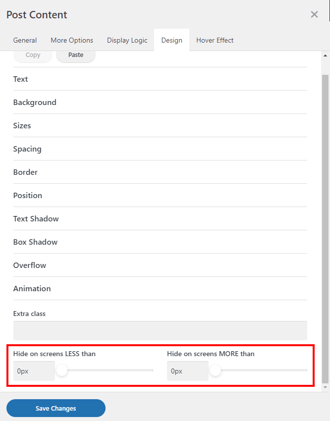
Responsive Display #
While editing the elements inside the Grid Layout, you can find additional settings at the bottom of the Design settings tab:
- Hide on screens LESS than
- Hide on screens MORE than
These settings, along with the responsive settings of the Design tab, allow a more precise behavior setup on different devices and screen widths.
Hover Effects #
While editing the Grid Layout elements, you can specify hover effects for them.
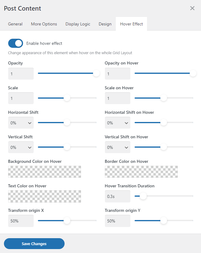
Hover effects include customization of:
- Opacity
- Scale
- Horizontal & Vertical Shift
- Background, Text, and Border Colors
- Hover transition duration
- Transform origin X, Y effects
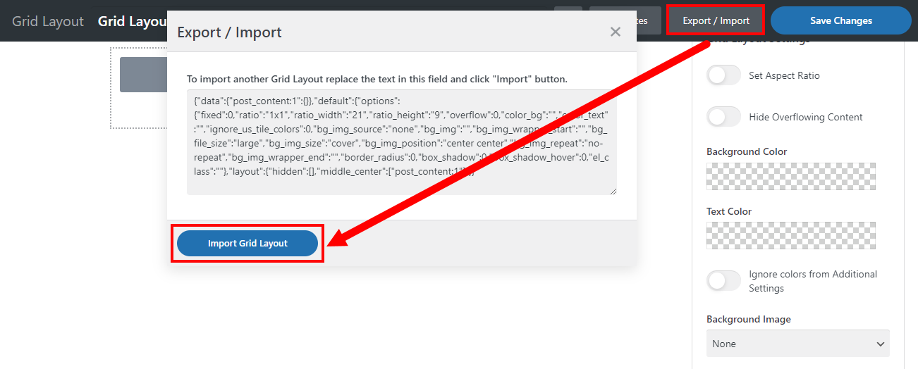
Grid Layout Export / Import #
You can copy and paste your Grid Layouts to use on different sites. Click the Export/Import button, copy the shortcodes, and press the Import Grid Layout button to implement the copied layout.
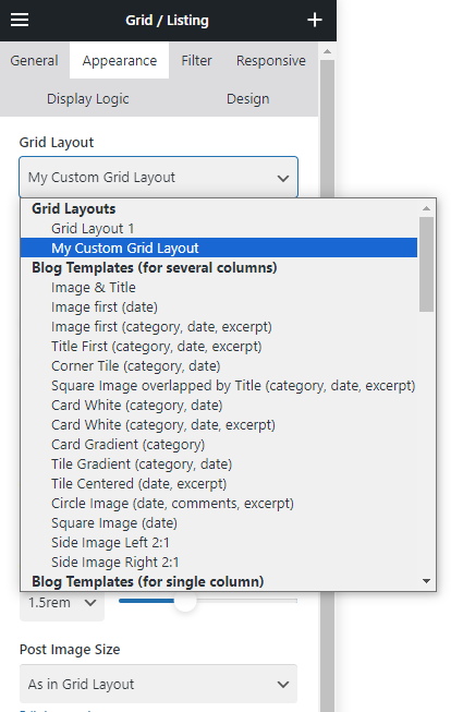
Assigning Grid Layout #
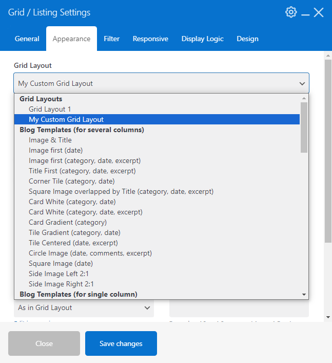
To apply a Grid Layout for the list elements, open its Appearance settings and pick the needed layout (custom layouts will appear at the top of the list)
FAQ #
I want the image inside the Grid Layout to change on hover; how do I achieve that? #
Use two elements showing relevant images. Then, use the Design > Position settings of the second one to show it in the layer above the previous one. For example, set the "Position" to "Absolute" and specify "0" as the value for its top, bottom, right, and left settings.
After this, activate Hover Effects for both elements. For the first one, set the baseline opacity to "1" and opacity on hover to "0". Specify the opposite settings for the second one.
A third-party WooCommerce plugin shows extra product price info, but it doesn't work in Grid Layout. Is there a way to fix that? #
While editing the Grid Layout, add a Product Data element set up to add "Actions for plugins compatibility." This should allow third-party scripts to work.
If it won't help, create a ticket with details.
I like my Grid Layout on the desktop, but it looks poorly on mobiles. How can I assign a different Grid Layout for mobiles? #
As of now, there's no way to use different Grid Layouts for the same element with the items list.
You can resolve this in two ways:
- Add a list (Grid, Carousel, Post List, Term List, Product List, User List) two times, use different Grid Layouts, and use Design settings to specify which one should show on Desktops, Laptops, Tablets, and Mobiles.
- While editing the Grid Layout, you can create two sets of needed items and place them, for example, inside different wrapper elements. This way, you can use the wrapper's Design settings to specify which should appear or be hidden on which screen width.
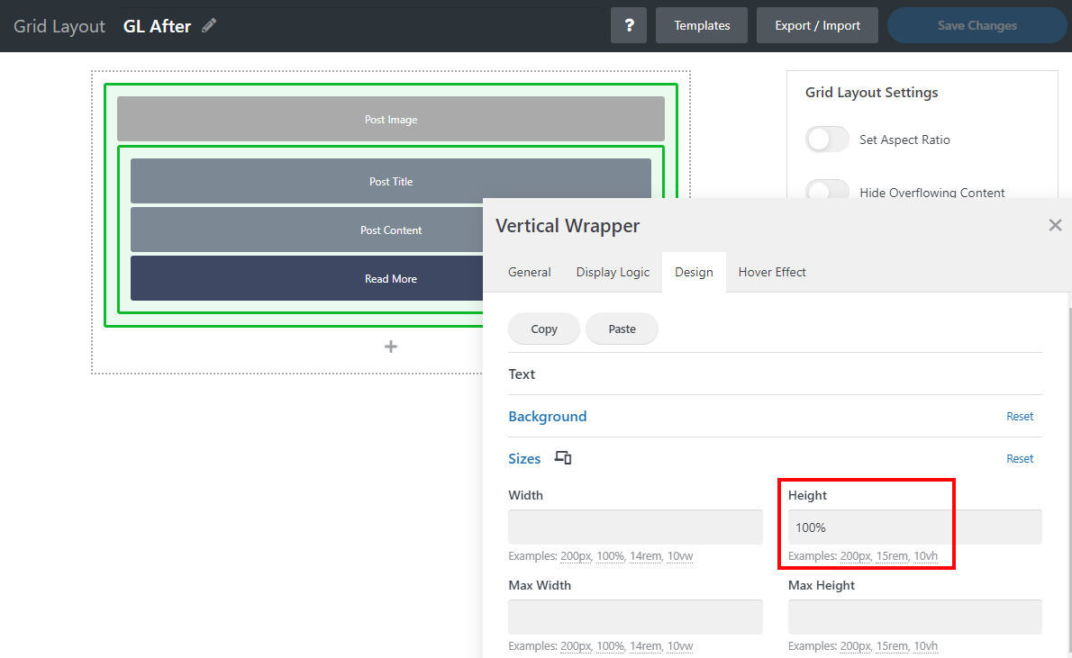
How can I equalize the height of list elements? #
By default, the height of the list element is defined by its content.
You can equalize the height of the elements with the following steps:
- Put all elements inside the parent Vertical Wrapper
- Transfer the background color and border to the parent Vertical Wrapper
- Use the parent Vertical Wrapper Design > Sizes settings to specify the height of 100%.
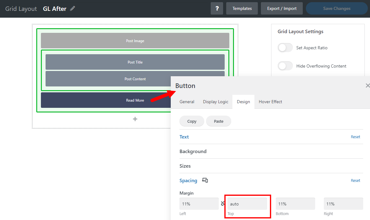
How can I align elements for the list items with different heights? #
In the example below, you can place buttons on the same line at the bottom by following these steps:
- Place the button as a first-level inner element of the parent Vertical Wrapper.
- Use the button's Design > Spacing settings to specify the top margin "auto."
How to apply changes to default Grid Layouts #
Go to Templates > Grid Layouts and create a new Grid Layout.
Use the Templates button to create a copy of the Grid Layout you'd like to change. Apply needed changes via element settings or by adding/removing elements. Save changes afterward.
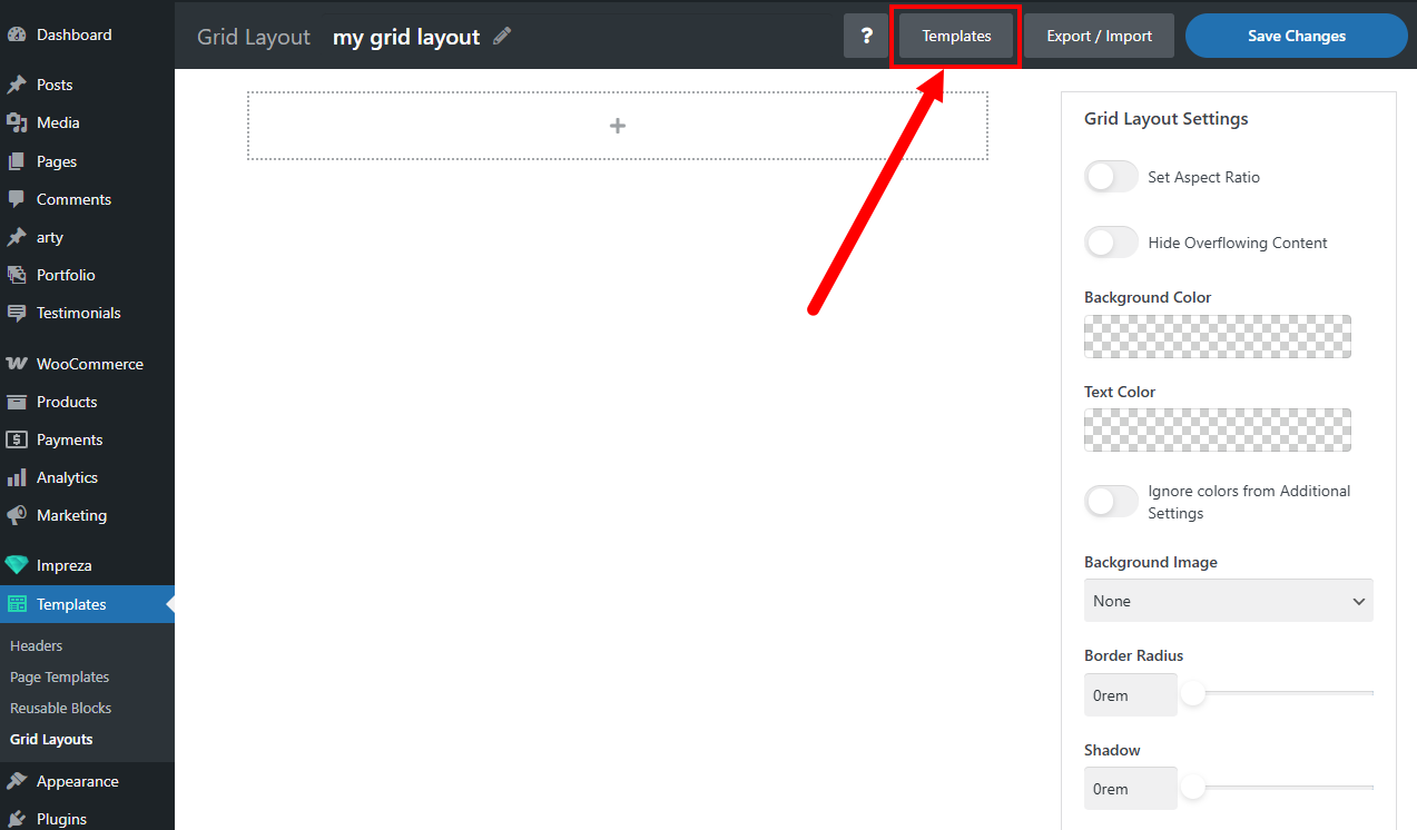
Assign your custom Grid Layout in the Appearance settings of the relevant Post List, Product List, Term List, Grid, or Carousel while editing the page.