Images
Updated 2 months ago
This article describes the mechanism of showing images on a Impreza-based site.
Every image uploaded into the Media Library will automatically create several thumbnails with smaller sizes (dimensions in pixels), this is a default WordPress mechanism. The number of such thumbnails depends on the original dimensions of an image and settings. Check the table below.
Predefined Image Sizes #
| Dimensions (px) | Provided by | System name | Changeable? | Used by default in |
|---|---|---|---|---|
| 1024 x 1024 | WordPress | large | In "Settings > Media" | — Post Image of new Grid Layout — Meta tag "og:image" |
| 300 x 300 | WordPress | medium | In "Settings > Media" | — Preloader Screen custom image |
| 150 x 150 (cropped) | WordPress | thumbnail | In "Settings > Media" |
— Image Slider "Thumbs" additional navigation |
| 600 x 600 (cropped) | WooCommerce (if installed) | shop_single | In "Appearance > Customize > WooCommerce > Products Images" | — Main Product image on Product pages |
| 300 x 300 (cropped) | WooCommerce (if installed) | shop_catalog | In "Appearance > Customize > WooCommerce > Products Images" | — All Product lists (Shop and Category pages, Cross-sell and Up-sell blocks) |
- (cropped) means that the thumbnail will be cropped to the exact width and height ignoring the proportions of an original image
- if two or more Image Sizes have equal values, then only one thumbnail will be generated
Regarding the table above when you upload a large image (bigger than 1024px), it generates 3 thumbnails (5 thumbnails if you're using WooCommerce) by default. All thumbnails are located in /wp-content/uploads/ folder of your WordPress installation, also thumbnails have a suffix in their file name, which means dimensions in pixels:

Adding new Image Sizes #
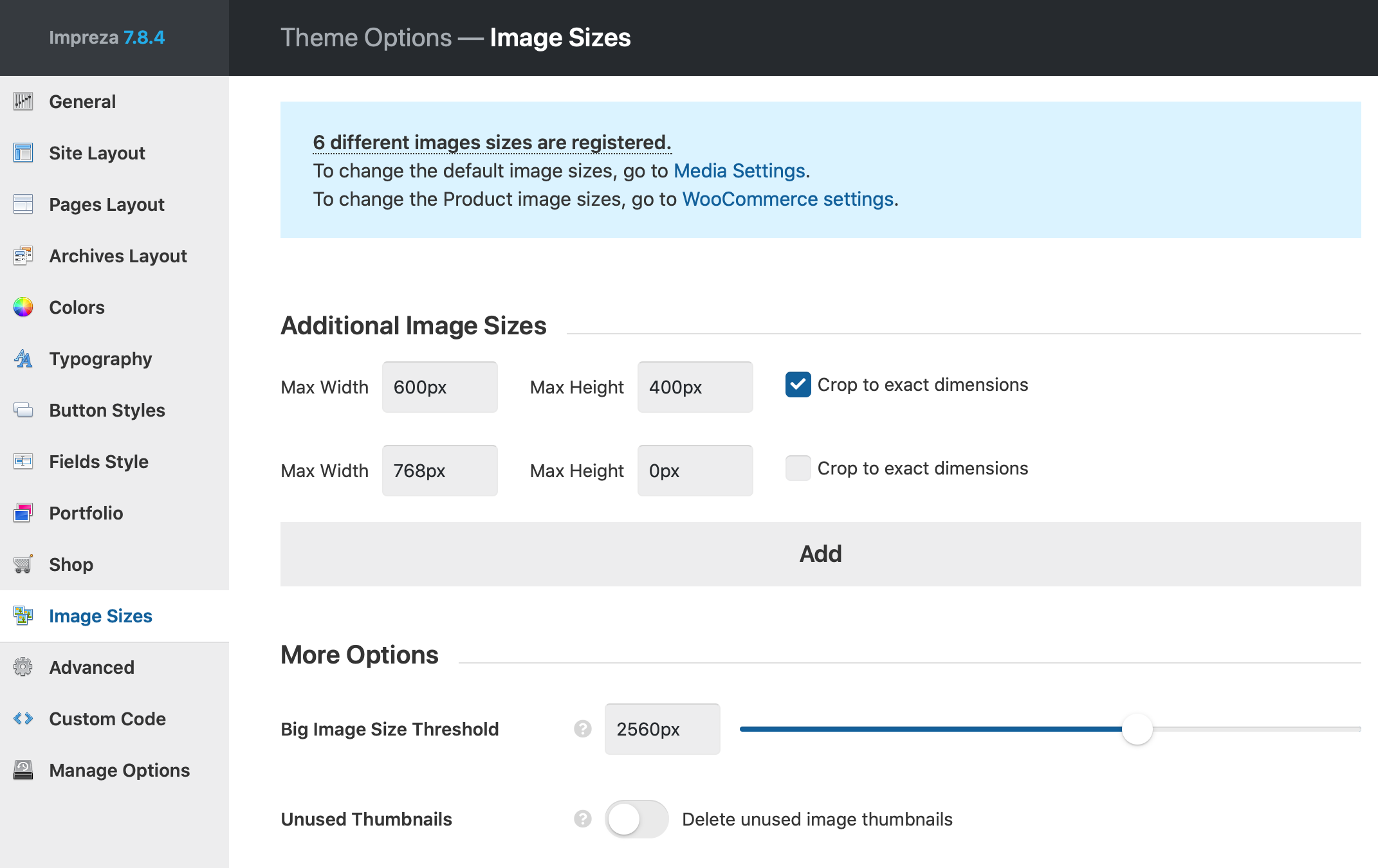
To add custom Image Sizes go to Theme Options > Image Sizes:

You can set any amount of additional image sizes. After adding new sizes or changing the existing ones you should regenerate your thumbnails.
We don't recommend setting many Image Sizes because every Image Size:
- increases uploading time, when you add images to the Media Library
- creates additional files in your upload directory regarding the number of your uploaded images. For example, if you upload 100 images to your website, you will have 600 files summary by default, and every additional Image Size will add 100 files after regenerating thumbnails.
Regenerating Thumbnails #
Regenerating is available in Impreza by default without additional plugins. When you change image sizes on the Theme Options > Image Sizes, all image thumbnails start to regenerate.
In case of any issues with regenerating thumbnails we recommend to use the Force Regenerate Thumbnails plugin.
Applying Image Sizes #
In most cases, the theme's elements use the most suitable image sizes, which are predefined by Impreza code, check the "Predefined Image Sizes" table for more information. To improve the website page loading speed management, we implemented the ability to select Image Sizes for the following elements:
- Image
- Image Slider
- Interactive Banner
- FlipBox
- Popup
- Person
- Grid
- Carousel
- Image via the "Add Media" button in the Text editor
- Gallery via the "Add Media" button in the Text editor
FAQ #
How to apply lazy loading to images #
All images you use in WordPress are lazy-loaded by default, you don't need to use extra plugins. Learn more in https://make.wordpress.org/core/2020/07/14/lazy-loading-images-in-5-5/
How to disable lazy loading for images above the fold? #
When you edit the Image element, you can disable its lazy loading via General > Disable Lazy Loading.
All background images are always lazy-loaded by modern browsers.


Why are my large full size images blurry? #
By default, WordPress applies the limitation of the "Full Size" as 2560px for all uploaded images.
You can change this limitation at Theme Options > Image Sizes > Big Image Size Threshold. If an image's height or width exceeds this threshold, it will be scaled down to this value by its larger dimension and used as the "Full Size" thumbnail.

Why do my images load a larger thumbnail on mobiles? #
By default, WordPress applies to all images HTML responsive attributes. Learn more.
Every browser automatically loads the appropriate image thumbnail based on the screen width and the screen density.
Since mobile screens have twice the pixel density, the image thumbnail will be twice as large as the screen width. For example, if the mobile screen is 380px wide, it will try to load a thumbnail with the width of 760px or the closest existing thumbnail to this value.
