Content Carousel
Updated 4 months ago
Content Carousel is the element that allows to rotate/slide items with different content.
How to Add Elements into Content Carousel #
Drag and drop elements inside the Content Carousel, choosing position via marker.
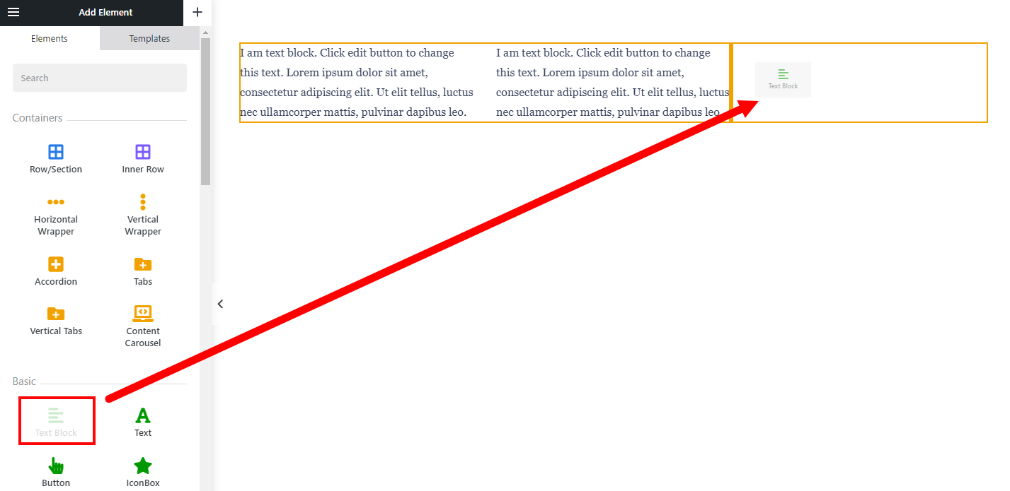
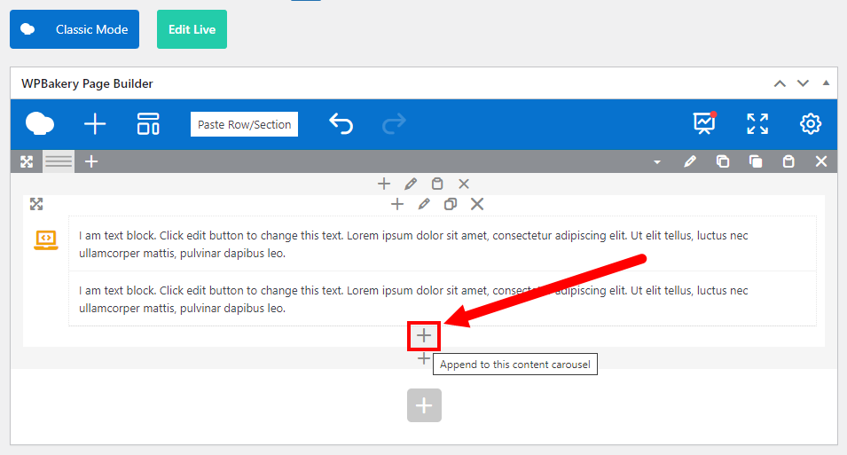
Press the "plus" icon and pick the needed element from the list.
- Row/Section
- Accordion
- Carousel
- Color Scheme Switch
- Contact Form
- Content Carousel
- Dropdown
- Gallery
- Grid
- Grid Filter
- Grid Order
- Image Slider
- List Filter
- List Order
- List Search
- Login
- Map
- Page Scroller
- Post List
- Post Carousel
- Product List
- Product Carousel
- Reusable Block
- Search
- Separator
- Tabs
- Term List
- Term Carousel
- User List
- Vertical Tabs (Tour)
General Settings #
This group of settings allows you to customize the appearance of the Content Carousel.
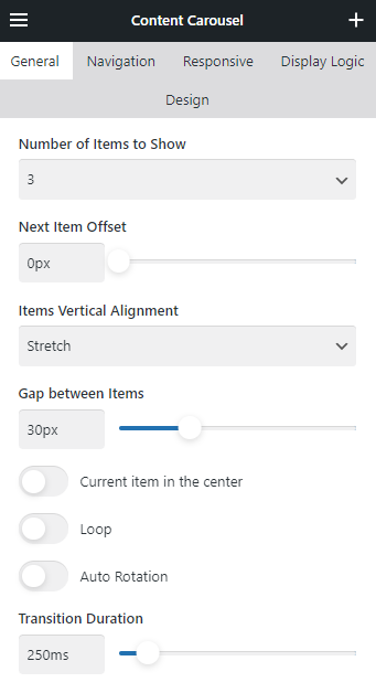
The Number of Items to Show defines the number of items that should appear on a single slide of the carousel. When set to Auto, it will define this number automatically, based on the width of inner elements.
Navigation #
This group of settings allows you to add and customize the appearance of navigation arrows and dots for the Content Carousel.

You can define if the slide changing should be possible via dragging on different devices by using relevant switches:
- Slide by mouse drag.
- Slide by touch drag.
Responsive #
This group of settings allows you to customize the Content Carousel appearance and navigation for different devices.
Use pre-defined or custom screen Breakpoint Width to apply needed changes.
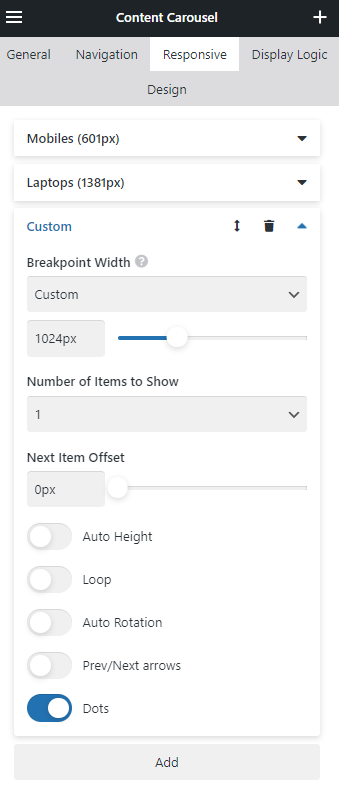
In Responsive, Prev/Next arrows and Dots inherit the appearance from the Navigation settings.