Contact Form
Updated 3 weeks ago
The Contact Form element allows you to design custom contact forms with various field types and layouts.
Check the Contact Form examples
Contact Form element supports the listed input field types:
- Text (single line)
- Text (multiple lines)
- Date
- Dropdown
- Checkboxes
- Radio buttons
- Upload File
- Text block
- Agreement checkbox
- Math Captcha
- reCAPTCHA
Actions After Sending #
In the Appearance settings tab, you can specify the "Action after sending" that should be applied after a successful form submission.
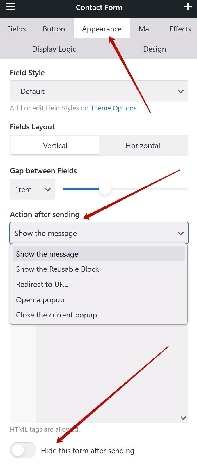
The available list of actions includes:
- Show the message - displays a custom message that supports HTML and shortcodes, similar to the "Email Subject" and "Email Message".
- Show the Reusable Block - displays one of the pre-designed content blocks you created at Templates > Reusable Blocks.
- Redirect to URL - custom redirect after form submission.
- Open a popup - opens a Popup element with the specified CSS selector (class or ID).
- Close the current popup - if the form itself was placed inside a popup, this action will close this popup after form submission.
For first two options the additional "Hide this form after sending" switch is available.
Data Sending #
When site visitors submit a contact form, the data is sent to the email address(es) specified in the element's settings.
In the Mail settings, you can specify the email subject, email message, recipient email, BCC email (blind copy), and reply-to address.
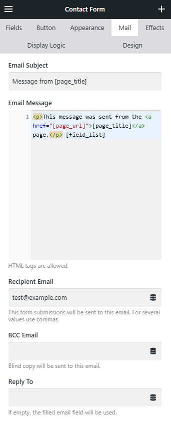
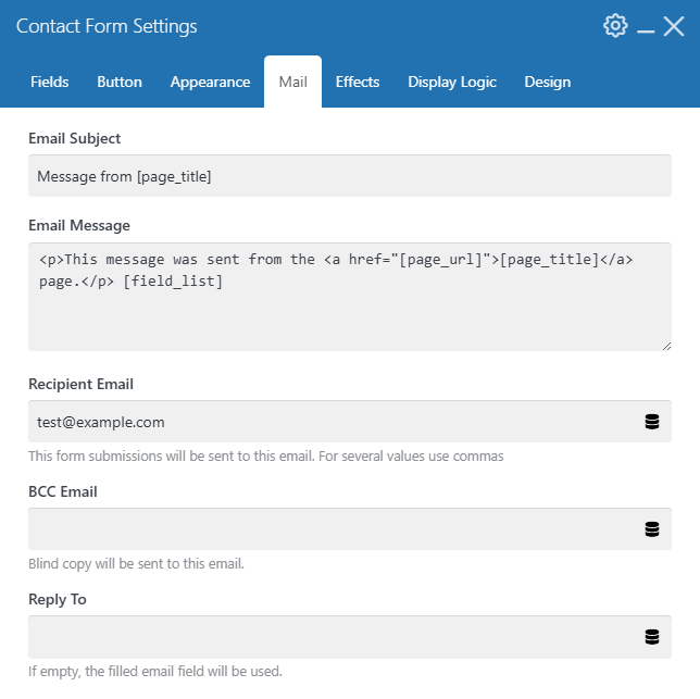
Email Subject and Email Message support the following shortcodes:
- [site_title] — the site title from the WordPress Settings > General
- [site_url] — the site URL
- [page_title] — the title of the page from which the form was submitted
- [page_url] — the URL of the page from which the form was submitted
- [sender_ip] — the sender IP address
- [sender_name] — the sender name if there's a text field inside the form with the active "Use the value of this field as sender's name of email". Multiple fields are supported, their values will be shown separated by space
- [sender_email] — the sender email if there's an email field inside the form with the active "Use the value of this field as sender's address of emails".
- [field_list] — an HTML markup with the list of all form fields (both filled and unfilled).
- [field_1], [field_2], [field_3], etc. — the value of the field with the specified number (from top to bottom). If a specific field is not filled by a sender, it returns an empty string.
- Any other shortcode registered on the website:
- theme elements, e.g. [us_btn], [us_cta], etc.
- shortcodes from 3rd-party plugins
- your custom shortcodes added via PHP code
add_shortcode()
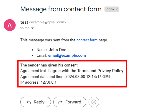
Sender Agreement Data #
When you use an Agreement checkbox type field, it will add extra data on the consent to the mail message:
- Agreement text
- Agreement date and time
- IP address
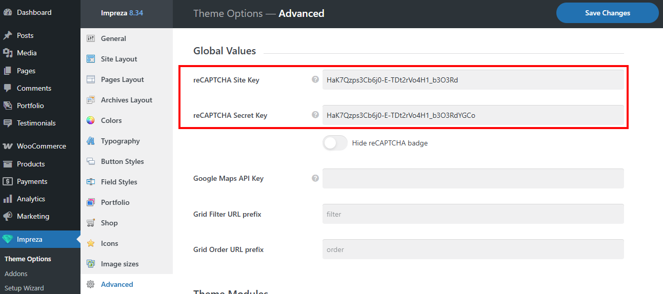
Work with Google reCAPTCHA #
Impreza supports using the Google reCAPTCHA v3 in built-in contact forms.
To use it in Impreza contact forms, go to Theme Options > Advanced > Global Values and specify the "reCAPTCHA Site Key" and "reCAPTCHA Secret Key." Get reCAPTCHA keys.
Once both keys are specified, you need to add the "reCAPTCHA" field to desired Contact Form. If you see the relevant badge in the right bottom corner, then the submission of this form will be checked using reCAPTCHA scoring.
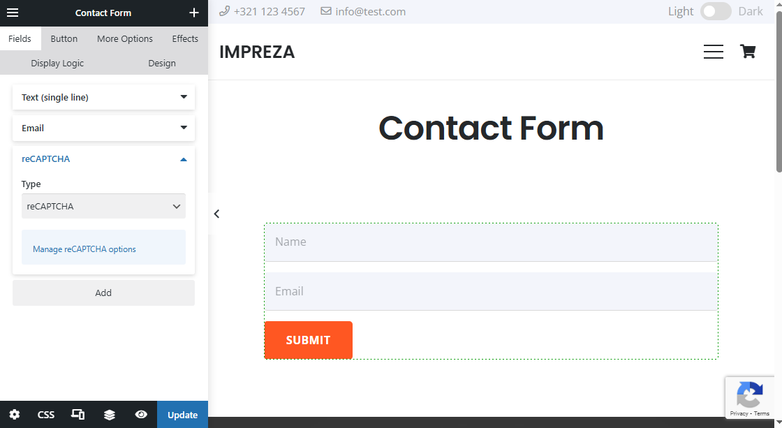
Forms without "reCAPTCHA" field will work as usual.
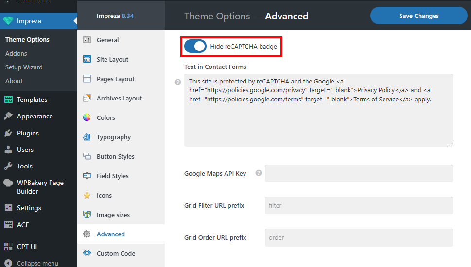
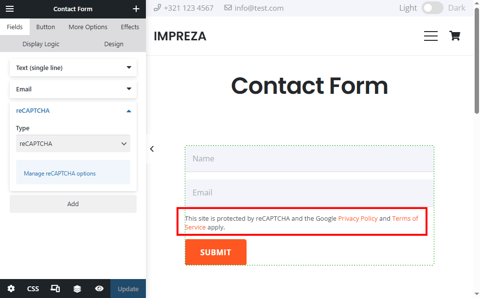
You can hide that badge by activating the "Hide reCAPTCHA badge" switch at Theme Options > Advanced > Global Values. You are allowed to hide the badge as long as you include the reCAPTCHA branding visibly in the user flow (source). So, if you enable the switch the predefined text will be added to every contact form with the reCAPTCHA field. You can edit that text in the relevant field below the switch.
How to Save Inbound Messages #
At Theme Options > Advanced, navigate to "Theme Modules" and activate the "Contact Form Inbound Messages" switch.
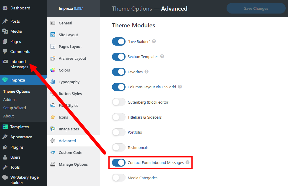
It will add a relevant post type that will gather and contain records of all contact form submissions on this site.
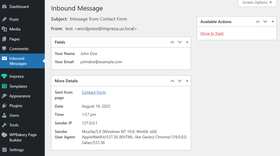
A file uploaded to the "Upload file" field type is not included in the inbound messages.
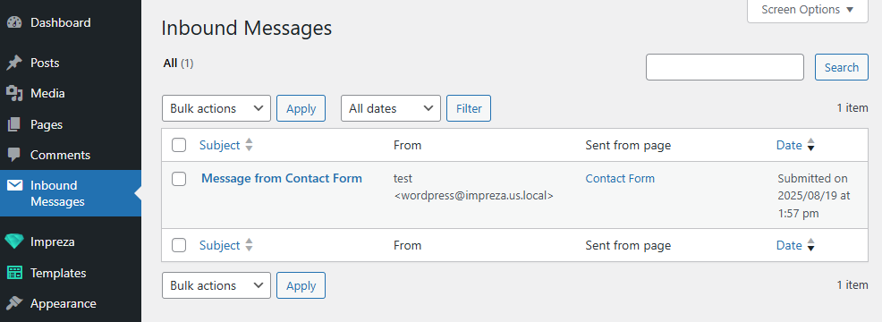
You can open the record to view detailed information about the sender, including submitted form fields, user agent, and IP address.
Auto Respond #
You can set up the auto-respond message to be sent after form submission:
- Ensure the email field has an active switch "Use the value of this field as sender's address of emails." Without it, the auto-respond email won't be sent.

- At the Mail tab, activate the "Auto respond to submitted form" switch and fill in the message. The Auto Respond Message field supports HTML tags and field shortcodes, similar to the Email Message field.

FAQ #
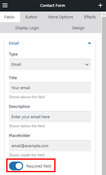
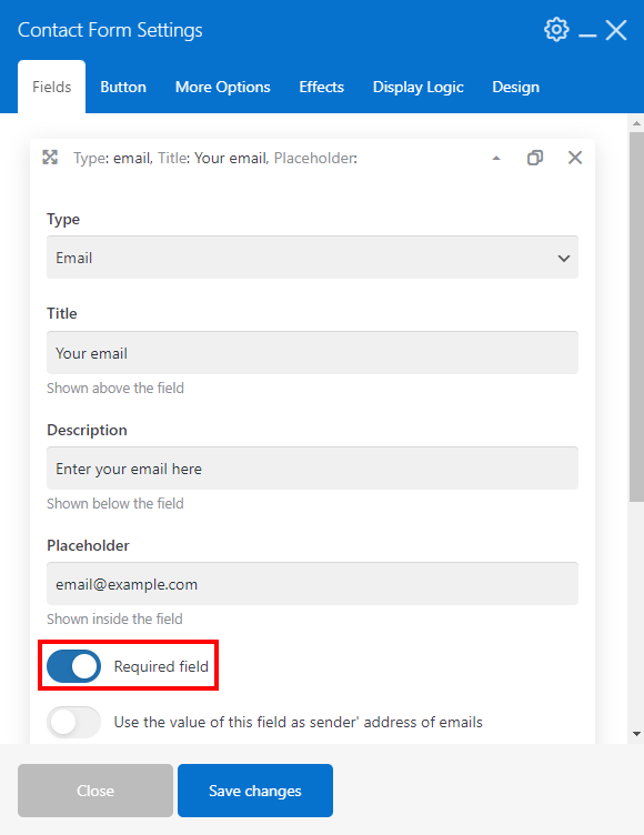
How to mark fields as required? #
Activate the Required field switch when editing the field, and the form will not send data until it is filled in.
When marking the Radio Button or the Dropdown field as required, specify the first value in the list as "Choose an option" or a similar call-to-action. The first value is reserved as the "default" one. It won't allow the form to be submitted unless another available value is selected.
How to make Radio buttons unselected by default? #
When you edit the Radio Buttons field type in your contact form, deactivate the "Pre-select the first value" switch.

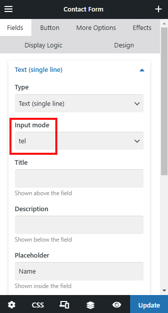
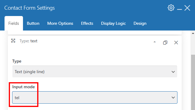
How to change a keyboard type for mobiles? #
For the Text (single line) field type there is the Input mode option. It allows to change the keyboard type on mobile phones to improve the experience for visitors when typing in a field. What types of keyboards are possible, see the corresponding article.
Input mode does not validate values: the visitor can still enter any value.
My form is not sending data. How to fix it? #
This commonly happens due to SMTP settings. Contact your hosting provider regarding this issue or set up the SMTP using third-party plugins.
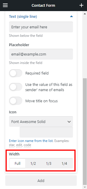
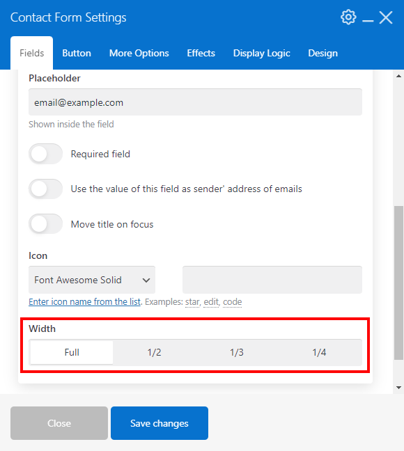
How to change the width of specific fields? #
By default, each new field takes the full available width of the form. Adjust the "Width" setting to show several fields in a single line.
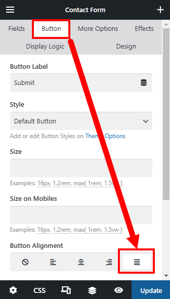
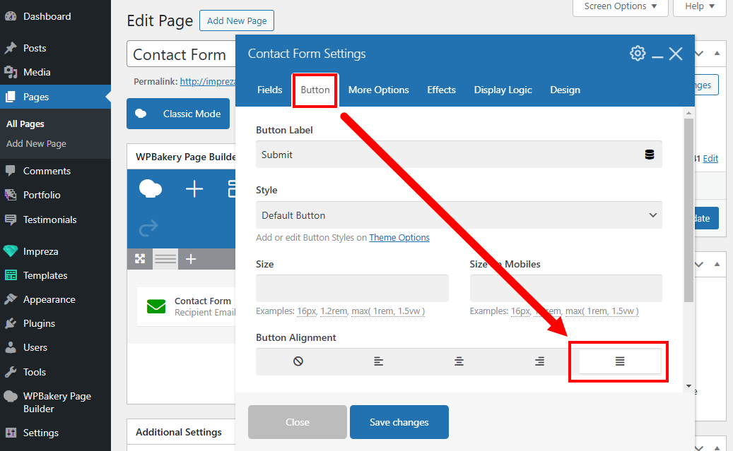
How do I stretch the submit button to the full available width? #
Open the Button settings tab and specify the Button Alignment: stretch to the full width.
How do I translate notification messages for required fields? #
Check the Localization article.